Chart position — tracked daily by LaunchShots
Screenshot changes — detected by LaunchShots
Screenshot style breakdown
Sampled from 6 of EKOM UP's App Store screenshots — background, accent and theme, measured by LaunchShots (not something Apple publishes).
#FC9C6C bg
#DD895F
#F46424 accent
#111111 text
- #1E arrivata EKOM UP!
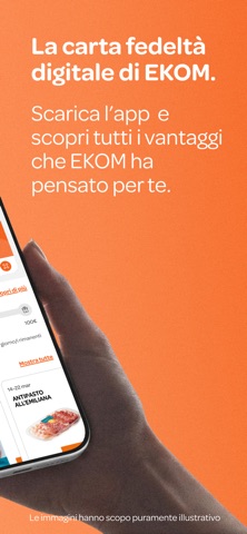
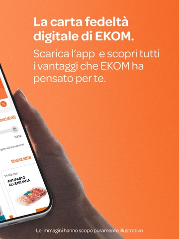
- #2digitale di EKOM. scopri tutti i vantaggi
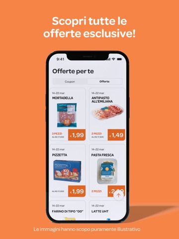
- #3Offerte perte
- #4Gli store di Ekom
- #5Offerte perte
- #6Prova una delle nostre ricette!
Captions read from the screenshots (OCR, may contain small errors): 6 headlines, 4 words on average (longest 7).
Screenshots



iPad screenshots




Icon palette
About this app
È arrivata EKOM UP, la carta fedeltà digitale di Ekom, semplice da usare e sempre con te sul tuo smartphone. Scarica l’app EKOM UP, registrati in pochi passaggi e ottieni subito la tua carta fedeltà digitale . Mostrala in cassa e accedi immediatamente a offerte dedicate, coupon esclusivi e vantaggi riservati. Offerte riservate Con EKOM UP accedi a una selezione di prodotti in sconto dedicati esclusivamente agli utenti registrati. Consulta le offerte direttamente dall’app nella sezione vantaggi-offerte, passa la tua card in cassa e inizia subito a risparmiare sulla spesa quotidiana. Attiva i coupon Con EKOM UP nella sezione vantaggi-coupon puoi trovare tutti i coupon digitali disponibili: -scegli i coupon che ti interessano -attivali direttamente dall’app -utilizzali in negozio passando la tua card in cassa Ricorda! Ogni coupon deve essere attivato prima dell’utilizzo. Partecipa ai co…
App details
What you can learn from EKOM UP
Every shipping app on the App Store has gone through the same decisions you're working through right now: which screenshot goes first, what caption sits over it, which device frame to show, what color the background should be. The 12 screenshots above are EKOM UP's answers to those questions — they're public, they're real, and they made it through Apple's review.
What the numbers say: EKOM UP runs a mixed light-and-dark set where the background shifts from screenshot to screenshot (first shot #FC9C6C) — each image has to stand on its own, so the captions carry more of the story. The accent colour we picked up, #F46424, is the one to reuse for badges, arrows and highlighted words if you borrow this look. Hit Use this style to open the editor with these exact colours and drop your own screenshot in.
Notice the first screenshot in particular. It's the one users see in search results and on the product page, and it's where most apps spend their best caption and tightest design. Look at the proportion of background to phone, where the text sits, what one thing the image is trying to communicate.
Want to see how other Lifestyle apps approach the same problem? Browse more Lifestyle apps in the showcase.
Take what works into your own screenshots
Open LaunchShots and design your App Store & Google Play screenshots — pick a device frame, drop captions, ship in minutes. Free, in your browser.
Open the screenshot editor →Apps with a similar look
Closest background + accent colours among the listings we've analysed — useful when you want to see the same palette handled by a different team.