Chart position — tracked daily by LaunchShots
Screenshot style breakdown
Sampled from 6 of Claw Master – Roguelike Hero's App Store screenshots — background, accent and theme, measured by LaunchShots (not something Apple publishes).
#2C3424 bg
#495042
#046C84 accent
#FFFFFF text
Screenshots


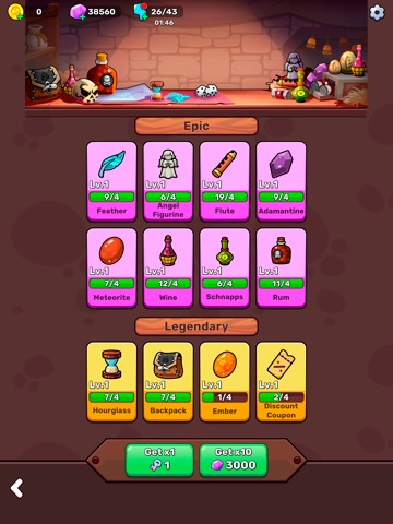
iPad screenshots




Icon palette
About this app
Claw Master — это уникальная игра, где классический автомат с клешнёй превращается в увлекательное приключение с элементами роглайк и RPG. Управляйте клешнёй, чтобы хватать оружие, ресурсы и бонусы, прокачивайте героя и исследуйте подземелья. Каждый поворот в игре непредсказуем: новые уровни, опасные враги, неожиданные находки и эпичные боссы. Это не просто аркада — здесь важны стратегия, тактика и ваши умения. Особенности игры: Автомат с клешнёй: интуитивный и простой геймплей, где решают точность и тайминг. Роглайк-механики: случайно сгенерированные подземелья, новые враги и уникальные события каждый раз. Система билдов: выбирайте способности и создавайте свою стратегию — больше урона, выше шанс добычи или мощная защита. Эпичные боссы: каждая битва уникальна и требует особого подхода. Прогресс героя: открывайте новые умения и становитесь сильнее между забегами. Мир полон секре…
App details
What you can learn from Claw Master – Roguelike Hero
Every shipping app on the App Store has gone through the same decisions you're working through right now: which screenshot goes first, what caption sits over it, which device frame to show, what color the background should be. The 16 screenshots above are Claw Master – Roguelike Hero's answers to those questions — they're public, they're real, and they made it through Apple's review.
What the numbers say: Claw Master – Roguelike Hero runs a dark set where the background shifts from screenshot to screenshot (first shot #2C3424) — each image has to stand on its own, so the captions carry more of the story. The accent colour we picked up, #046C84, is the one to reuse for badges, arrows and highlighted words if you borrow this look. Hit Use this style to open the editor with these exact colours and drop your own screenshot in.
Notice the first screenshot in particular. It's the one users see in search results and on the product page, and it's where most apps spend their best caption and tightest design. Look at the proportion of background to phone, where the text sits, what one thing the image is trying to communicate.
Want to see how other Games apps approach the same problem? Browse more Games apps in the showcase.
Take what works into your own screenshots
Open LaunchShots and design your App Store & Google Play screenshots — pick a device frame, drop captions, ship in minutes. Free, in your browser.
Open the screenshot editor →Apps with a similar look
Closest background + accent colours among the listings we've analysed — useful when you want to see the same palette handled by a different team.