Screenshot style breakdown
Sampled from 6 of Let's Go Easy's App Store screenshots — background, accent and theme, measured by LaunchShots (not something Apple publishes).
#94DCEC bg
#82C1CF
#FCB404 accent
#111111 text
Screenshots



Icon palette
About this app
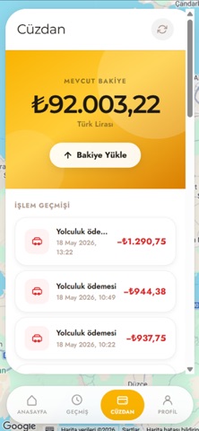
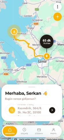
Let's Go Easy ile şehirde hareket etmek artık çok daha kolay. Tek dokunuşla en yakın sürücüyü çağır, rotanı haritada takip et ve güvenle varış noktana ulaş. 3 Araç Seçeneği Easy, Platinum ve VIP kategorileriyle her bütçeye ve her yolculuğa uygun araç. Gerçek Zamanlı Takip Sürücünü haritada canlı izle, tahmini varış süresini anında gör. Çoklu Durak Tek yolculukta birden fazla adres ekle, tüm duraklarını planla. Kolay Ödeme Uygulama içi cüzdan ile hızlı ve temassız ödeme. Değerlendirme Sistemi Her yolculuk sonrası sürücünü puanla, daha iyi hizmet al. Anlık Bildirimler Sürücü kabul ettiğinde, yola çıktığında ve kapına geldiğinde anında haberdar ol. 1. Uygulamayı aç, nereye gideceğini gir 2. Araç kategorini seç, ücret tahmini gör 3. Teklifi onayla, en yakın sürücü yola çıksın 4. Sürücünü haritada takip et, varışında öde Let's Go Easy; güvenilir s…
App details
What you can learn from Let's Go Easy
Every shipping app on the App Store has gone through the same decisions you're working through right now: which screenshot goes first, what caption sits over it, which device frame to show, what color the background should be. The 6 screenshots above are Let's Go Easy's answers to those questions — they're public, they're real, and they made it through Apple's review.
What the numbers say: Let's Go Easy runs a light set where the background shifts from screenshot to screenshot (first shot #94DCEC) — each image has to stand on its own, so the captions carry more of the story. The accent colour we picked up, #FCB404, is the one to reuse for badges, arrows and highlighted words if you borrow this look. Hit Use this style to open the editor with these exact colours and drop your own screenshot in.
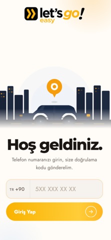
Notice the first screenshot in particular. It's the one users see in search results and on the product page, and it's where most apps spend their best caption and tightest design. Look at the proportion of background to phone, where the text sits, what one thing the image is trying to communicate.
Want to see how other Travel apps approach the same problem? Browse more Travel apps in the showcase.
Take what works into your own screenshots
Open LaunchShots and design your App Store & Google Play screenshots — pick a device frame, drop captions, ship in minutes. Free, in your browser.
Open the screenshot editor →Apps with a similar look
Closest background + accent colours among the listings we've analysed — useful when you want to see the same palette handled by a different team.