Chart position — tracked daily by LaunchShots
Screenshot style breakdown
Sampled from 5 of チラストック|家族で共有する在庫管理アプリ's App Store screenshots — background, accent and theme, measured by LaunchShots (not something Apple publishes).
#CC8C64 bg
#B37B58
#F4DC9C accent
#111111 text
Screenshots
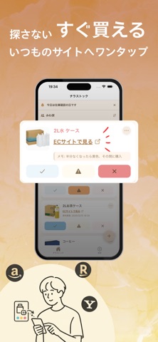
iPad screenshots


Icon palette
About this app
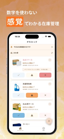
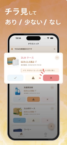
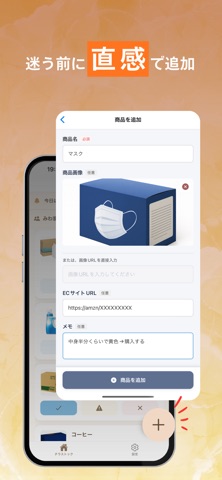
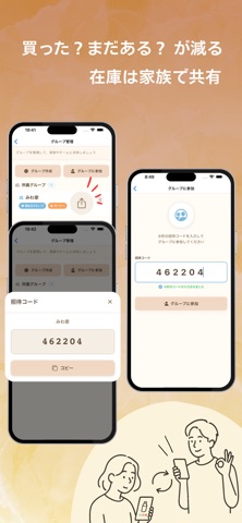
チラストック - 家族で共有する在庫管理アプリ 家の在庫管理をもっと簡単に、もっと楽しく。チラストックは、家族や同居人と一緒に使える在庫管理アプリです。日々の買い物で「あれ、まだあったっけ?」と悩むことがなくなります。 主な機能 3段階の色分けで直感的に管理 • 青色: 在庫あり - 安心して使える状態 • 黄色: 残り少ない - そろそろ買い足しが必要 • 赤色: 在庫なし - すぐに購入が必要 一目で在庫状況がわかるので、買い物リストを作る手間も省けます。 リアルタイム共有機能 家族や同居人と在庫情報をリアルタイムで共有できます。誰かが在庫状態を更新すると、すぐに全員の画面に反映されます。「誰かが買ってくれた?」という無駄な買い物を防げます。 グループ機能 複数のグループを作成して、用途別に在庫を管理できます。キッチンの在庫、洗面所の日用品、リビングの消耗品など、場所や用途に応じてグループ分けが可能です。 ECサイト連携 商品にECサイトのURLを登録しておけば、在庫切れ時にワンタップで購入ページにアクセスできます。買…
App details
What you can learn from チラストック|家族で共有する在庫管理アプリ
Every shipping app on the App Store has gone through the same decisions you're working through right now: which screenshot goes first, what caption sits over it, which device frame to show, what color the background should be. The 10 screenshots above are チラストック|家族で共有する在庫管理アプリ's answers to those questions — they're public, they're real, and they made it through Apple's review.
What the numbers say: チラストック|家族で共有する在庫管理アプリ runs a light set where the background shifts from screenshot to screenshot (first shot #CC8C64) — each image has to stand on its own, so the captions carry more of the story. The accent colour we picked up, #F4DC9C, is the one to reuse for badges, arrows and highlighted words if you borrow this look. Hit Use this style to open the editor with these exact colours and drop your own screenshot in.
Notice the first screenshot in particular. It's the one users see in search results and on the product page, and it's where most apps spend their best caption and tightest design. Look at the proportion of background to phone, where the text sits, what one thing the image is trying to communicate.
Want to see how other Lifestyle apps approach the same problem? Browse more Lifestyle apps in the showcase.
Take what works into your own screenshots
Open LaunchShots and design your App Store & Google Play screenshots — pick a device frame, drop captions, ship in minutes. Free, in your browser.
Open the screenshot editor →Apps with a similar look
Closest background + accent colours among the listings we've analysed — useful when you want to see the same palette handled by a different team.