Chart position — tracked daily by LaunchShots
Screenshot changes — detected by LaunchShots
Screenshot style breakdown
Sampled from 6 of めろとーく | LINE相性分析's App Store screenshots — background, accent and theme, measured by LaunchShots (not something Apple publishes).
#FCE4F4 bg
#DDC8D6
#1CD404 accent
#111111 text
Screenshots




Icon palette
About this app
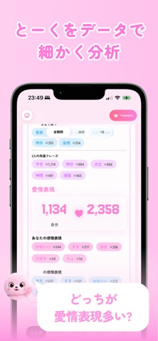
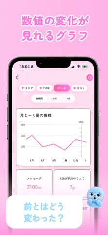
みんな使ってるLINE相性診断&トーク分析アプリ「めろとーく」 LINEのトーク履歴を読み込むだけで、 ふたりの関係が16タイプに分類される相性診断アプリ。 相手にバレることはありません。 トーク内容はインターネットを経由せず、すべて端末内で安全に解析されます。 (AI機能利用時のみインターネット接続が必要です) 「なんとなく続いてるこの関係、本当はどんな距離感?」 「実は気持ちのバランス、ズレてる…?」 ——そんな"言葉にしにくい関係性"が、データで見えてきます。 ◎ めろとーくでわかること ・お互いのトーク量・スタンプ数・通話回数 ・よく使う言葉やフレーズ ・会話が多い時間帯/曜日 ・返信スピードとリズム ・直近1週間・1ヶ月のトーク傾向の変化 これらを総合的に分析して、 ふたりの関係を16タイプに分類した「相性診断結果」として表示します。 ◎ 分析結果はこんな画面で見られます ・結果画面 ふたりの相性タイプ・総合コメントを表示 ・習慣分析 よく使う言葉、トーク時間帯、返信速度の傾向 ・行動分析 トーク数、スタンプ…
App details
What you can learn from めろとーく | LINE相性分析
Every shipping app on the App Store has gone through the same decisions you're working through right now: which screenshot goes first, what caption sits over it, which device frame to show, what color the background should be. The 7 screenshots above are めろとーく | LINE相性分析's answers to those questions — they're public, they're real, and they made it through Apple's review.
What the numbers say: めろとーく | LINE相性分析 runs a light set where the background shifts from screenshot to screenshot (first shot #FCE4F4) — each image has to stand on its own, so the captions carry more of the story. The accent colour we picked up, #1CD404, is the one to reuse for badges, arrows and highlighted words if you borrow this look. Hit Use this style to open the editor with these exact colours and drop your own screenshot in.
Notice the first screenshot in particular. It's the one users see in search results and on the product page, and it's where most apps spend their best caption and tightest design. Look at the proportion of background to phone, where the text sits, what one thing the image is trying to communicate.
Want to see how other Utilities apps approach the same problem? Browse more Utilities apps in the showcase.
Take what works into your own screenshots
Open LaunchShots and design your App Store & Google Play screenshots — pick a device frame, drop captions, ship in minutes. Free, in your browser.
Open the screenshot editor →Apps with a similar look
Closest background + accent colours among the listings we've analysed — useful when you want to see the same palette handled by a different team.