Chart position — tracked daily by LaunchShots
Screenshot changes — detected by LaunchShots
Screenshot style breakdown
Sampled from 6 of Luuupa-实时压力监测与健康洞察's App Store screenshots — background, accent and theme, measured by LaunchShots (not something Apple publishes).
#F4F4F4 bg
#D6D6D6
#FCEC84 accent
#111111 text
Screenshots


Icon palette
About this app
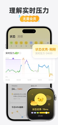
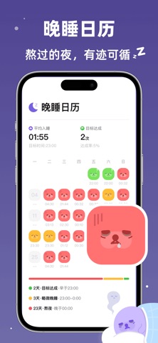
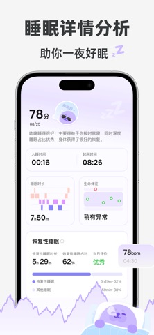
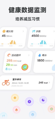
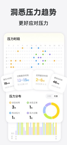
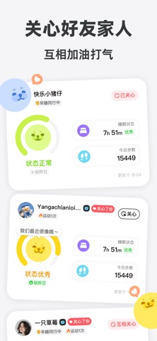
你有没有过这种时刻:明明睡了很久,醒来还是很累;什么都没发生,却突然觉得压力很大。 有时候,我们比想象中更晚发现自己的变化。 但那些说不清楚的疲惫、紧绷和状态起伏,身体或许早就留下了痕迹。 Luuupa,让你真正看见自己的状态。 ◎ 不是一个数字,而是今天的你 压力并不总是等到“感觉撑不住”才出现。 Luuupa 基于 Apple Watch 的 HRV 和心率数据,帮你看见一天里的压力变化。什么时候更紧绷,什么时候慢慢恢复,那些很难描述的感受,也开始有迹可循。 不用等到很累的时候,才想起关心自己。 ◎ 不只记录,更想帮你读懂自己 为什么明明睡了 8 小时,今天还是很累?为什么有些日子状态很好,有些时候却莫名疲惫? 睡眠、静息心率、活动、生命体征,还有每天喝了多少水、晒了多久太阳……Luuupa 把这些散落在一天里的数据和行为慢慢连接起来。 记录得越久,你看到的不只是数据,而是属于自己的健康规律。 什么让你状态更好,什么可能影响了你的睡眠和压力——那些关于身体的答案,会一点点变得清晰。 ◎ 照顾自己,也看见彼此 当你开始更了解自己,也可以把这份看见…
App details
What you can learn from Luuupa-实时压力监测与健康洞察
Every shipping app on the App Store has gone through the same decisions you're working through right now: which screenshot goes first, what caption sits over it, which device frame to show, what color the background should be. The 8 screenshots above are Luuupa-实时压力监测与健康洞察's answers to those questions — they're public, they're real, and they made it through Apple's review.
What the numbers say: Luuupa-实时压力监测与健康洞察 runs a mixed light-and-dark set where the background shifts from screenshot to screenshot (first shot #F4F4F4) — each image has to stand on its own, so the captions carry more of the story. The accent colour we picked up, #FCEC84, is the one to reuse for badges, arrows and highlighted words if you borrow this look. Hit Use this style to open the editor with these exact colours and drop your own screenshot in.
Notice the first screenshot in particular. It's the one users see in search results and on the product page, and it's where most apps spend their best caption and tightest design. Look at the proportion of background to phone, where the text sits, what one thing the image is trying to communicate.
Want to see how other Health & Fitness apps approach the same problem? Browse more Health & Fitness apps in the showcase.
Take what works into your own screenshots
Open LaunchShots and design your App Store & Google Play screenshots — pick a device frame, drop captions, ship in minutes. Free, in your browser.
Open the screenshot editor →Apps with a similar look
Closest background + accent colours among the listings we've analysed — useful when you want to see the same palette handled by a different team.