Chart position — tracked daily by LaunchShots
Screenshot changes — detected by LaunchShots
Screenshot style breakdown
Sampled from 6 of トリミン2!-トリッキーミーン2 いじわる脳トレパズルゲーム's App Store screenshots — background, accent and theme, measured by LaunchShots (not something Apple publishes).
#FCE4F4 bg
#DDC8D6
#FC849C accent
#111111 text
Screenshots
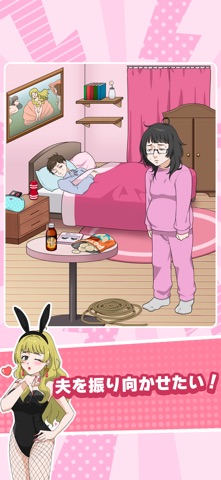


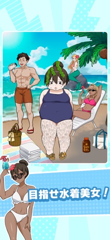
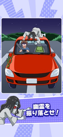
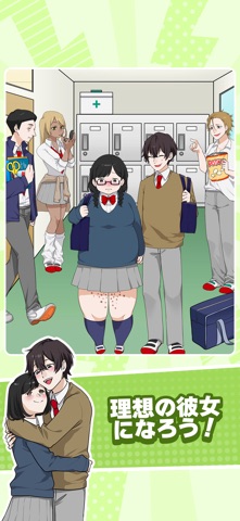

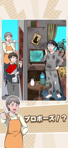

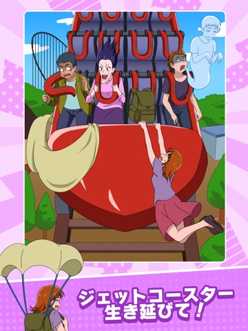
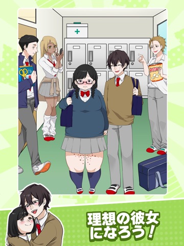
iPad screenshots






Icon palette
About this app
あの“トリミン”に続編登場!『トリッキーミーン2』リリース! アイテムを動かしてイラストを変化させる、いじわる謎解きゲームがパワーアップ! 前作で好評だった「動かして解く」仕組みはそのままに、ステージ構成・ギミック・演出がさらに進化! 夫を振り向かせたい女性を助けたり、トラブルだらけのシーンをひらめきで解決したり…。 今回もひとクセある問題があなたを待っています! ・新ステージ大量追加 ・ひっかけ要素さらに強化 ・成功時の爽快演出が進化 ・スキマ時間で脳トレにも最適 前作クリア済みのあなたも、初めてのあなたも楽しめる内容に! ひらめき力、試してみる?
App details
What you can learn from トリミン2!-トリッキーミーン2 いじわる脳トレパズルゲーム
Every shipping app on the App Store has gone through the same decisions you're working through right now: which screenshot goes first, what caption sits over it, which device frame to show, what color the background should be. The 20 screenshots above are トリミン2!-トリッキーミーン2 いじわる脳トレパズルゲーム's answers to those questions — they're public, they're real, and they made it through Apple's review.
What the numbers say: トリミン2!-トリッキーミーン2 いじわる脳トレパズルゲーム runs a light set where the background shifts from screenshot to screenshot (first shot #FCE4F4) — each image has to stand on its own, so the captions carry more of the story. The accent colour we picked up, #FC849C, is the one to reuse for badges, arrows and highlighted words if you borrow this look. Hit Use this style to open the editor with these exact colours and drop your own screenshot in.
Notice the first screenshot in particular. It's the one users see in search results and on the product page, and it's where most apps spend their best caption and tightest design. Look at the proportion of background to phone, where the text sits, what one thing the image is trying to communicate.
Want to see how other Games apps approach the same problem? Browse more Games apps in the showcase.
Take what works into your own screenshots
Open LaunchShots and design your App Store & Google Play screenshots — pick a device frame, drop captions, ship in minutes. Free, in your browser.
Open the screenshot editor →Apps with a similar look
Closest background + accent colours among the listings we've analysed — useful when you want to see the same palette handled by a different team.