Chart position — tracked daily by LaunchShots
Screenshot style breakdown
Sampled from 5 of FoodBite: ИИ счетчик калорий's App Store screenshots — background, accent and theme, measured by LaunchShots (not something Apple publishes).
#0C9C04 bg
#2EA927
#A4B404 accent
#FFFFFF text
Screenshots

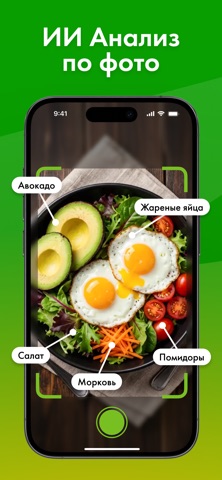
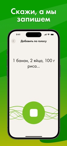
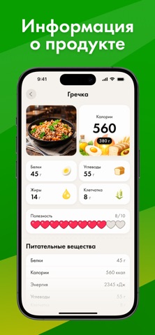

iPad screenshots


Icon palette
About this app
AI-трекер калорий и умный дневник питания — простой способ контролировать рацион, считать КБЖУ и достигать целей по снижению веса или набору массы. Добавляйте еду по фото, голосу, тексту или вручную — встроенный ИИ поможет определить продукты и рассчитать калории за секунды. Приложение подойдёт для похудения, фитнеса, набора мышц и ежедневного контроля питания. Вся статистика по калориям и макросам — в одном месте. ОСНОВНЫЕ ВОЗМОЖНОСТИ AI-подсчёт калорий Сфотографируйте еду — ИИ распознает продукт и рассчитает калории и КБЖУ. 4 способа добавления еды • по фото с ИИ • голосом с ИИ • по текстовому описанию • вручную через поиск и каталог Дневник питания Удобный журнал приёмов пищи на каждый день с разбивкой по калориям и макросам. Калькулятор КБЖУ Автоматический расчёт белков, жиров, углеводов и калорий по каждому продукту и за день. Статистика и прогресс Отслеживайте динамику пита…
App details
What you can learn from FoodBite: ИИ счетчик калорий
Every shipping app on the App Store has gone through the same decisions you're working through right now: which screenshot goes first, what caption sits over it, which device frame to show, what color the background should be. The 9 screenshots above are FoodBite: ИИ счетчик калорий's answers to those questions — they're public, they're real, and they made it through Apple's review.
What the numbers say: FoodBite: ИИ счетчик калорий runs a dark set with one background colour (#0C9C04) carried across every screenshot — the listing reads as a single poster when the shots sit side by side in search results. The accent colour we picked up, #A4B404, is the one to reuse for badges, arrows and highlighted words if you borrow this look. Hit Use this style to open the editor with these exact colours and drop your own screenshot in.
Notice the first screenshot in particular. It's the one users see in search results and on the product page, and it's where most apps spend their best caption and tightest design. Look at the proportion of background to phone, where the text sits, what one thing the image is trying to communicate.
Want to see how other Health & Fitness apps approach the same problem? Browse more Health & Fitness apps in the showcase.
Take what works into your own screenshots
Open LaunchShots and design your App Store & Google Play screenshots — pick a device frame, drop captions, ship in minutes. Free, in your browser.
Open the screenshot editor →Apps with a similar look
Closest background + accent colours among the listings we've analysed — useful when you want to see the same palette handled by a different team.