Chart position — tracked daily by LaunchShots
Screenshot style breakdown
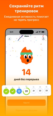
Sampled from 6 of EveryFit: спорт и шагомер's App Store screenshots — background, accent and theme, measured by LaunchShots (not something Apple publishes).
#FC5C04 bg
#FC7227
#FCB484 accent
#FFFFFF text
Screenshots


Icon palette
About this app
EveryFit - это приложение, которое помогает больше двигаться, тренироваться регулярнее и делать спорт частью обычной жизни. В одном месте собраны челленджи, личные цели, трекинг шагов и тренировок, лидерборды, стрики, бонусы и доступ к фитнес-площадкам. Сервис помогает не просто следить за активностью, а поддерживать мотивацию и видеть свой прогресс каждый день. Для компаний EveryFit - это удобный способ вовлекать сотрудников в wellbeing без сложного запуска и лишней нагрузки на команду. Можно проводить общие и командные челленджи, поддерживать здоровые привычки, добавлять элемент игры и делать корпоративную активность более живой и интересной. А для сотрудников это понятный и удобный инструмент, где видно свои результаты, прогресс команды, текущие активности и доступные награды. Для пользователей EveryFit делает спорт проще и ближе. Можно отслеживать ежедневную активность, ставить це…
App details
What you can learn from EveryFit: спорт и шагомер
Every shipping app on the App Store has gone through the same decisions you're working through right now: which screenshot goes first, what caption sits over it, which device frame to show, what color the background should be. The 6 screenshots above are EveryFit: спорт и шагомер's answers to those questions — they're public, they're real, and they made it through Apple's review.
What the numbers say: EveryFit: спорт и шагомер runs a dark set with one background colour (#FC5C04) carried across every screenshot — the listing reads as a single poster when the shots sit side by side in search results. The accent colour we picked up, #FCB484, is the one to reuse for badges, arrows and highlighted words if you borrow this look. Hit Use this style to open the editor with these exact colours and drop your own screenshot in.
Notice the first screenshot in particular. It's the one users see in search results and on the product page, and it's where most apps spend their best caption and tightest design. Look at the proportion of background to phone, where the text sits, what one thing the image is trying to communicate.
Want to see how other Health & Fitness apps approach the same problem? Browse more Health & Fitness apps in the showcase.
Take what works into your own screenshots
Open LaunchShots and design your App Store & Google Play screenshots — pick a device frame, drop captions, ship in minutes. Free, in your browser.
Open the screenshot editor →Apps with a similar look
Closest background + accent colours among the listings we've analysed — useful when you want to see the same palette handled by a different team.