Screenshot changes — detected by LaunchShots
Screenshot style breakdown
Sampled from 6 of Mood & Emotion Tracker : Riley's App Store screenshots — background, accent and theme, measured by LaunchShots (not something Apple publishes).
#0C2444 bg
#2E425E
#445C7C accent
#FFFFFF text
Screenshots

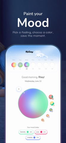


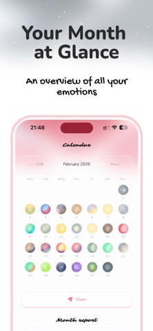
Icon palette
About this app
Riley — Mood Journal & Emotion Tracker Your daily mood diary for mental health, mindfulness, and emotional wellness. Riley transforms the way you track and understand your feelings. Each day, draw a unique mood orb that captures your emotional state, add journal notes, photos, and voice memos — then watch your emotional patterns come to life through a beautiful spiral or calendar view. Whether you're managing stress, anxiety, or depression, building daily wellness habits, or simply practising self-care and gratitude, Riley gives you a private, creative space to explore your inner world. HOW IT WORKS Daily Mood Tracking Log your feelings each day with a colourful mood orb. Choose from the full emotions wheel, add context, and build a living diary of your moods. Habit & Streak Building Create daily wellness habits and track your streaks. Consistency is key — Riley helps you stay on t…
App details
What you can learn from Mood & Emotion Tracker : Riley
Every shipping app on the App Store has gone through the same decisions you're working through right now: which screenshot goes first, what caption sits over it, which device frame to show, what color the background should be. The 8 screenshots above are Mood & Emotion Tracker : Riley's answers to those questions — they're public, they're real, and they made it through Apple's review.
What the numbers say: Mood & Emotion Tracker : Riley runs a mixed light-and-dark set where the background shifts from screenshot to screenshot (first shot #0C2444) — each image has to stand on its own, so the captions carry more of the story. The accent colour we picked up, #445C7C, is the one to reuse for badges, arrows and highlighted words if you borrow this look. Hit Use this style to open the editor with these exact colours and drop your own screenshot in.
Notice the first screenshot in particular. It's the one users see in search results and on the product page, and it's where most apps spend their best caption and tightest design. Look at the proportion of background to phone, where the text sits, what one thing the image is trying to communicate.
Want to see how other Health & Fitness apps approach the same problem? Browse more Health & Fitness apps in the showcase.
Take what works into your own screenshots
Open LaunchShots and design your App Store & Google Play screenshots — pick a device frame, drop captions, ship in minutes. Free, in your browser.
Open the screenshot editor →Apps with a similar look
Closest background + accent colours among the listings we've analysed — useful when you want to see the same palette handled by a different team.