Chart position — tracked daily by LaunchShots
Screenshot style breakdown
Sampled from 6 of 私は積読家 - 積読管理と読書記録's App Store screenshots — background, accent and theme, measured by LaunchShots (not something Apple publishes).
#ECE4D4 bg
#CFC8BA
#AC7464 accent
#111111 text
Reading the caption text from the screenshots in your browser…
Screenshots





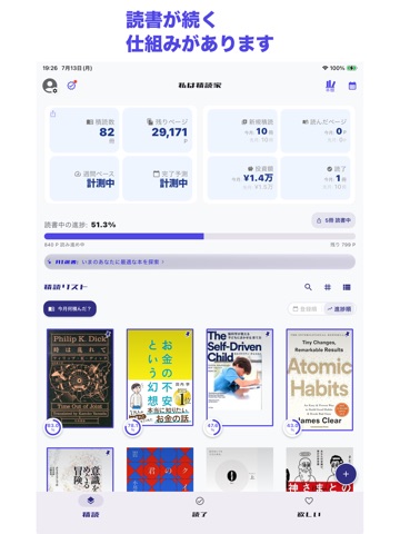
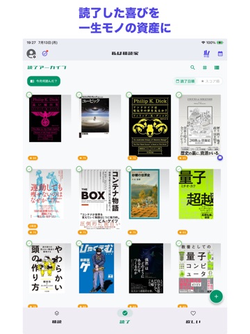
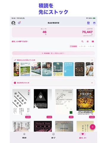
iPad screenshots

Icon palette
About this app
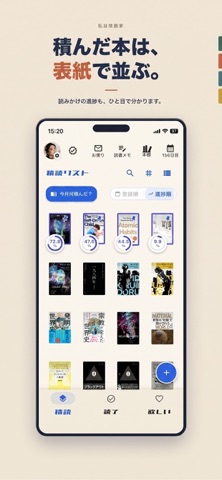
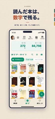
積読は、減らさなくていい。 読んでいない本の厚みを合計すると、1本の塔になります。 83冊で2m65cm。「未読83冊」だと気が重いのに、「2m65cm」だと誇らしい。 同じ本なのに、測り方を変えるだけで変わります。 『私は積読家』は、積読を減らすためではなく、 積み上げてきたものとして眺めるための読書記録アプリです。 ◆ 3つのタブ ・積読 買ったけれど読み終えていない本。読書中の進捗もここで。 ・読了 読み終えた本。偏愛スコア(100点満点)で評価を残せます。 ・欲しい まだ持っていない、気になっている本。 順番どおりに動かす義務はありません。 いきなり読了に入れても、読了から積読に戻して再読しても構いません。 ◆ 2つの塔と、1つの本棚 ・積読タワー 積んでいる本を1冊ずつ積み上げた塔。高さは実際の本の厚みから計算します。 30cm定規、机の高さ、住宅の天井、モアイ像、東京スカイツリーまで目盛りが出ます。 冊数だけでなく、総額と総重量も一緒に表示されます。 ・読了タワー 読み終えた本だけで建つ、もう一本の塔。先…
App details
What you can learn from 私は積読家 - 積読管理と読書記録
Every shipping app on the App Store has gone through the same decisions you're working through right now: which screenshot goes first, what caption sits over it, which device frame to show, what color the background should be. The 14 screenshots above are 私は積読家 - 積読管理と読書記録's answers to those questions — they're public, they're real, and they made it through Apple's review.
What the numbers say: 私は積読家 - 積読管理と読書記録 runs a light set with one background colour (#ECE4D4) carried across every screenshot — the listing reads as a single poster when the shots sit side by side in search results. The accent colour we picked up, #AC7464, is the one to reuse for badges, arrows and highlighted words if you borrow this look. Hit Use this style to open the editor with these exact colours and drop your own screenshot in.
Notice the first screenshot in particular. It's the one users see in search results and on the product page, and it's where most apps spend their best caption and tightest design. Look at the proportion of background to phone, where the text sits, what one thing the image is trying to communicate.
Want to see how other Book apps approach the same problem? Browse more Book apps in the showcase.
Take what works into your own screenshots
Open LaunchShots and design your App Store & Google Play screenshots — pick a device frame, drop captions, ship in minutes. Free, in your browser.
Open the screenshot editor →Apps with a similar look
Closest background + accent colours among the listings we've analysed — useful when you want to see the same palette handled by a different team.