Chart position — tracked daily by LaunchShots
Screenshot changes — detected by LaunchShots
Screenshot style breakdown
Sampled from 6 of فضفض صداقات - شات تعارف اصدقاء's App Store screenshots — background, accent and theme, measured by LaunchShots (not something Apple publishes).
#FC5C64 bg
#FC7279
#940C14 accent
#FFFFFF text
Screenshots


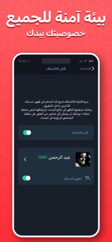
iPad screenshots


Icon palette
About this app
مرحبًا بك في فضفض مع صديق - مساحة اجتماعية قائمة على التعبير بالمشاعر واكتشاف الأشخاص بطريقة آمنة وخصوصية عالية. يعتمد التطبيق على موجز عاطفي فريد باستخدام الإيموجي، حيث يمكنك مشاركة حالتك الشعورية واستكشاف أشخاص آخرين من خلال اهتماماتهم وتعبيرهم العاطفي، ثم إرسال طلب تواصل باختيارك. كيف يعمل التطبيق؟ شارك حالتك عبر الإيموجي في الموجز العاطفي استكشف منشورات ومشاعر الآخرين اطّلع على الملفات الشخصية والاهتمامات أرسل طلب إضافة بشكل اختياري تبدأ المحادثة فقط بعد قبول الطرف الآخر نؤمن بتجربة تواصل قائمة على الراحة والموافقة، وليس الدردشة العشوائية. مميزات التطبيق: موجز عاطفي فريد يعتمد على الإيموجي فقط للتعبير اكتشاف أشخاص حسب الاهتمامات والتفاعل خصوصية عالية (الصور الشخصية اختيارية) نظام تواصل قائم على الموافقة (لا توجد محادثات إجبارية) أدوات حظر وإبلاغ لتعزيز الأمان بيئة آمنة مع أنظمة إشراف ومراقبة المحتوى تصميم بسيط وسريع وسهل الاستخدام الخصوصية أولاً في فضفض مع صديق: ل…
App details
What you can learn from فضفض صداقات - شات تعارف اصدقاء
Every shipping app on the App Store has gone through the same decisions you're working through right now: which screenshot goes first, what caption sits over it, which device frame to show, what color the background should be. The 12 screenshots above are فضفض صداقات - شات تعارف اصدقاء's answers to those questions — they're public, they're real, and they made it through Apple's review.
What the numbers say: فضفض صداقات - شات تعارف اصدقاء runs a dark set where the background shifts from screenshot to screenshot (first shot #FC5C64) — each image has to stand on its own, so the captions carry more of the story. The accent colour we picked up, #940C14, is the one to reuse for badges, arrows and highlighted words if you borrow this look. Hit Use this style to open the editor with these exact colours and drop your own screenshot in.
Notice the first screenshot in particular. It's the one users see in search results and on the product page, and it's where most apps spend their best caption and tightest design. Look at the proportion of background to phone, where the text sits, what one thing the image is trying to communicate.
Want to see how other Lifestyle apps approach the same problem? Browse more Lifestyle apps in the showcase.
Take what works into your own screenshots
Open LaunchShots and design your App Store & Google Play screenshots — pick a device frame, drop captions, ship in minutes. Free, in your browser.
Open the screenshot editor →Apps with a similar look
Closest background + accent colours among the listings we've analysed — useful when you want to see the same palette handled by a different team.