Chart position — tracked daily by LaunchShots
Screenshot changes — detected by LaunchShots
Screenshot style breakdown
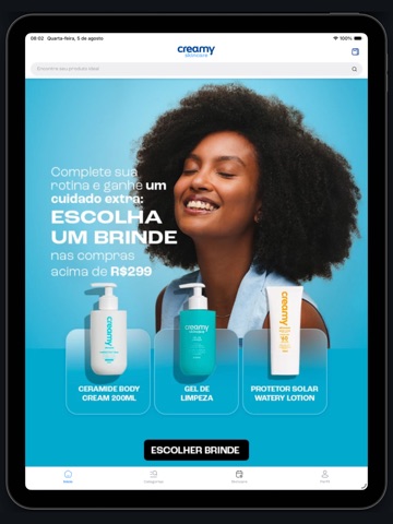
Sampled from 6 of Creamy Skincare's App Store screenshots — background, accent and theme, measured by LaunchShots (not something Apple publishes).
#04549C bg
#276BA9
#04ACFC accent
#FFFFFF text
- #1Aproveite os beneficios exclusivos SO NO APP!
- #2Retire seus produtos EM UMA HORA!
- #3Quem conhece a tecnologia Creamy, não troca
- #4Acompanhe seus pedidos pelo app com mais facilidade
- #6Monte sua rotina de skincare personalizada de acordo com as necessidades da sua pele
Captions read from the screenshots (OCR, may contain small errors): 5 headlines, 8.4 words on average (longest 14).
Screenshots


iPad screenshots



Icon palette
About this app
Sua jornada para a pele dos sonhos começa aqui. A Creamy une alta concentração de ativos, ciência e transparência para transformar sua pele. Com o nosso app oficial, você não apenas compra produtos; você entende o que sua pele precisa. Por que baixar o app Creamy? Shopping Facilitado: Encontre toda a nossa linha (ácidos, hidratantes e protetores) em poucos cliques. Skincare Personalizado: Dúvidas sobre o que usar? Receba recomendações baseadas no seu tipo de pele (oleosa, seca, mista ou sensível). Alertas de Reposição: Nunca fique sem o seu rosinha ou azulzinho favorito. Ciência ao seu Alcance: Informações detalhadas sobre Retinol, Vitamina C, Ácido Glicólico e muito mais. Promoções Exclusivas: Descontos e brindes que você só encontra no aplicativo. Tratamentos Direcionados: Controle de Acne e Oleosidade: Fórmulas que limpam e tratam sem agredir. Uniformização de Manchas: Tecnologia…
App details
What you can learn from Creamy Skincare
Every shipping app on the App Store has gone through the same decisions you're working through right now: which screenshot goes first, what caption sits over it, which device frame to show, what color the background should be. The 11 screenshots above are Creamy Skincare's answers to those questions — they're public, they're real, and they made it through Apple's review.
What the numbers say: Creamy Skincare runs a mixed light-and-dark set where the background shifts from screenshot to screenshot (first shot #04549C) — each image has to stand on its own, so the captions carry more of the story. The accent colour we picked up, #04ACFC, is the one to reuse for badges, arrows and highlighted words if you borrow this look. Hit Use this style to open the editor with these exact colours and drop your own screenshot in.
Notice the first screenshot in particular. It's the one users see in search results and on the product page, and it's where most apps spend their best caption and tightest design. Look at the proportion of background to phone, where the text sits, what one thing the image is trying to communicate.
Want to see how other Shopping apps approach the same problem? Browse more Shopping apps in the showcase.
Take what works into your own screenshots
Open LaunchShots and design your App Store & Google Play screenshots — pick a device frame, drop captions, ship in minutes. Free, in your browser.
Open the screenshot editor →Apps with a similar look
Closest background + accent colours among the listings we've analysed — useful when you want to see the same palette handled by a different team.