Chart position — tracked daily by LaunchShots
Screenshot style breakdown
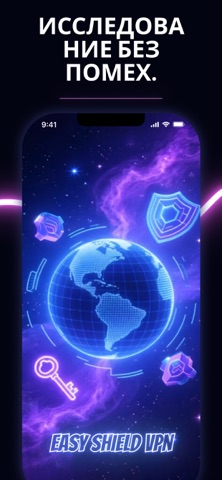
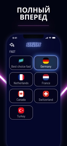
Sampled from 4 of Легкий Hit VPN's App Store screenshots — background, accent and theme, measured by LaunchShots (not something Apple publishes).
#040414 bg
#272734
#0C1C7C accent
#FFFFFF text
Screenshots


Icon palette
About this app
Easy Hit: Ваш цифровой телохранитель Пьете ли вы латте в шумном кафе или исследуете новый город на другом конце света — мы позаботимся о том, чтобы ваш цифровой след принадлежал только вам. Почему выбирают Easy Hit? Конфиденциальность превыше всего: Мы используем передовые технологии шифрования для защиты вашей активности в сети. Просматривайте сайты, смотрите видео и общайтесь с уверенностью, что никто не заглядывает вам через «виртуальное плечо». Простота в одно касание: Забудьте о сложных настройках. Наш интуитивно понятный интерфейс позволяет защитить соединение одним нажатием — безопасность, которая становится естественной привычкой. Умное подключение: Больше никаких гаданий. Интеллектуальная система автоматически подберет оптимальный сервер для вашего местоположения, обеспечивая максимальную скорость без ущерба для защиты. Безопасность в реальном мире Мобильный офис: Защитите …
App details
What you can learn from Легкий Hit VPN
Every shipping app on the App Store has gone through the same decisions you're working through right now: which screenshot goes first, what caption sits over it, which device frame to show, what color the background should be. The 4 screenshots above are Легкий Hit VPN's answers to those questions — they're public, they're real, and they made it through Apple's review.
What the numbers say: Легкий Hit VPN runs a dark set with one background colour (#040414) carried across every screenshot — the listing reads as a single poster when the shots sit side by side in search results. The accent colour we picked up, #0C1C7C, is the one to reuse for badges, arrows and highlighted words if you borrow this look. Hit Use this style to open the editor with these exact colours and drop your own screenshot in.
Notice the first screenshot in particular. It's the one users see in search results and on the product page, and it's where most apps spend their best caption and tightest design. Look at the proportion of background to phone, where the text sits, what one thing the image is trying to communicate.
Want to see how other Utilities apps approach the same problem? Browse more Utilities apps in the showcase.
Take what works into your own screenshots
Open LaunchShots and design your App Store & Google Play screenshots — pick a device frame, drop captions, ship in minutes. Free, in your browser.
Open the screenshot editor →Apps with a similar look
Closest background + accent colours among the listings we've analysed — useful when you want to see the same palette handled by a different team.