Chart position — tracked daily by LaunchShots
Screenshot changes — detected by LaunchShots
Screenshot style breakdown
Sampled from 6 of 塔塔冒险队's App Store screenshots — background, accent and theme, measured by LaunchShots (not something Apple publishes).
#8C64E4 bg
#9C79E7
#FCC434 accent
#FFFFFF text
Reading the caption text from the screenshots in your browser…
Screenshots
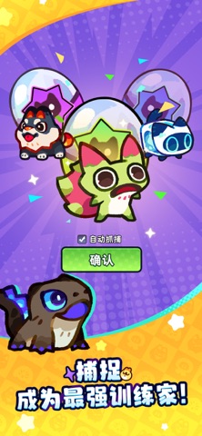


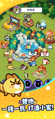
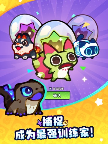
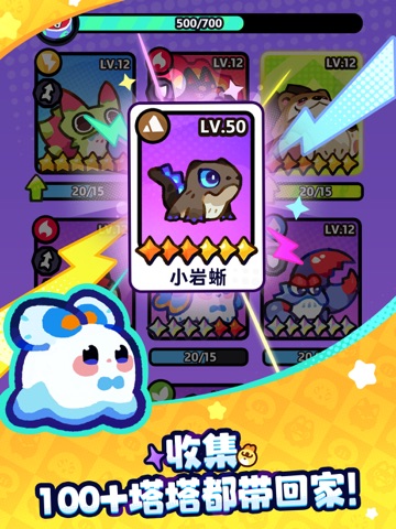
iPad screenshots



Icon palette
About this app
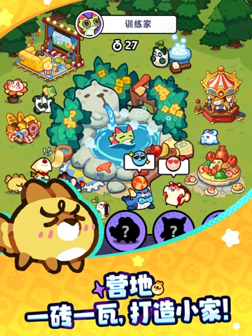
【收集!100+塔塔轻松拿下!】 拒绝千篇一律的设计——流口水的火果蛙、委屈脸的鸭梨……个个萌度爆表。新玩家首月就有机会收集所有塔塔! 【进化!萌度爆表但实力超标!】 喂食,进化,实力增强!一路到霸气四阶状态!还能随机触发闪光形态,看看你能解锁多少? 【对战!部署阵营,和臭臭一较高下!】 属性相克、阵型部署、流派组合任你玩转,碾压蜂拥而至的臭臭大军! 【建造!为塔塔打造专属小家】 一砖一瓦,帮塔塔们打造一座暖意融融的小家!对了,尝试下和它们互动,比如把猫冰放进泳池里看看?
App details
What you can learn from 塔塔冒险队
Every shipping app on the App Store has gone through the same decisions you're working through right now: which screenshot goes first, what caption sits over it, which device frame to show, what color the background should be. The 12 screenshots above are 塔塔冒险队's answers to those questions — they're public, they're real, and they made it through Apple's review.
What the numbers say: 塔塔冒险队 runs a mixed light-and-dark set where the background shifts from screenshot to screenshot (first shot #8C64E4) — each image has to stand on its own, so the captions carry more of the story. The accent colour we picked up, #FCC434, is the one to reuse for badges, arrows and highlighted words if you borrow this look. Hit Use this style to open the editor with these exact colours and drop your own screenshot in.
Notice the first screenshot in particular. It's the one users see in search results and on the product page, and it's where most apps spend their best caption and tightest design. Look at the proportion of background to phone, where the text sits, what one thing the image is trying to communicate.
Want to see how other Games apps approach the same problem? Browse more Games apps in the showcase.
Take what works into your own screenshots
Open LaunchShots and design your App Store & Google Play screenshots — pick a device frame, drop captions, ship in minutes. Free, in your browser.
Open the screenshot editor →Apps with a similar look
Closest background + accent colours among the listings we've analysed — useful when you want to see the same palette handled by a different team.