Chart position — tracked daily by LaunchShots
Screenshot style breakdown
Sampled from 6 of نسك الحج والعمرة's App Store screenshots — background, accent and theme, measured by LaunchShots (not something Apple publishes).
#FCFCFC bg
#DDDDDD
#044C24 accent
#111111 text
Screenshots


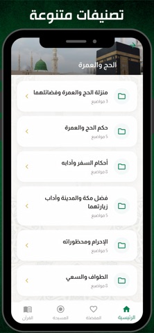

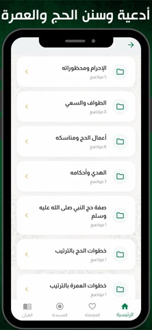

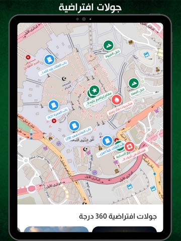
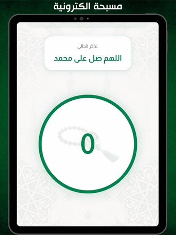
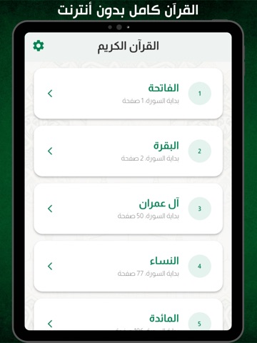
iPad screenshots






Icon palette
About this app
تطبيق نسك الحج والعمرة هو الرفيق الرقمي الأمثل لكل مسلم يطمح لأداء المناسك وفق السنة النبوية المطهرة بيسر وطمأنينة. تم تصميم التطبيق ليعمل بكفاءة عالية بدون إنترنت ليكون معك في كل لحظة بمكة المكرمة والمشاعر المقدسة. لماذا تختار تطبيق نسك الحج والعمرة؟ مكتبة أدعية شاملة: يضم التطبيق كافة أدعية العمرة والحج المأثورة عن النبي صلى الله عليه وسلم، بما في ذلك أدعية الطواف والسعي وأذكار اليوم والليلة. شرح المناسك خطوة بخطوة: دليل تفصيلي مصور ومكتوب يشرح صفة العمرة والحج، مما يجعلك في غنى عن البحث في الكتب الورقية. مسبحة إلكترونية متطورة: تساعدك في إحصاء التسبيحات والأذكار أثناء الطواف والسعي لضمان التركيز في العبادة. التوجيهات والسنن الشرعية: قسم خاص يوضح المحظورات والمباحات والسنن المتعلقة بالإحرام والمناسك لضمان صحة النسك. واجهة مستخدم ذكية: تصميم عصري وبسيط يراعي ظروف المستخدم أثناء الحركة والازدحام، لسهولة الوصول للمعلومة بضغطة واحدة. محتوى موثوق: جميع المعلومات مراجعة لضمان دقتها و…
App details
What you can learn from نسك الحج والعمرة
Every shipping app on the App Store has gone through the same decisions you're working through right now: which screenshot goes first, what caption sits over it, which device frame to show, what color the background should be. The 20 screenshots above are نسك الحج والعمرة's answers to those questions — they're public, they're real, and they made it through Apple's review.
What the numbers say: نسك الحج والعمرة runs a mixed light-and-dark set where the background shifts from screenshot to screenshot (first shot #FCFCFC) — each image has to stand on its own, so the captions carry more of the story. The accent colour we picked up, #044C24, is the one to reuse for badges, arrows and highlighted words if you borrow this look. Hit Use this style to open the editor with these exact colours and drop your own screenshot in.
Notice the first screenshot in particular. It's the one users see in search results and on the product page, and it's where most apps spend their best caption and tightest design. Look at the proportion of background to phone, where the text sits, what one thing the image is trying to communicate.
Want to see how other Reference apps approach the same problem? Browse more Reference apps in the showcase.
Take what works into your own screenshots
Open LaunchShots and design your App Store & Google Play screenshots — pick a device frame, drop captions, ship in minutes. Free, in your browser.
Open the screenshot editor →Apps with a similar look
Closest background + accent colours among the listings we've analysed — useful when you want to see the same palette handled by a different team.