Screenshot style breakdown
Sampled from 4 of АЭРОТЕРМЫ — Городской курорт's App Store screenshots — background, accent and theme, measured by LaunchShots (not something Apple publishes).
#0CB4CC bg
#0A9EB3
#E41C7C accent
#111111 text
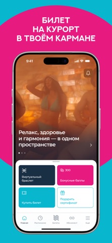
- #1НА КУРОРТ В ТВОЁМ КАРМАНЕ
- #2БЫСТРЫЙ ВХОД В КОМПЛЕКС
- #4ПОКУПАЙТЕ БИЛЕТЫ ОНЛАЙН БЕЗ ОЧЕРЕДИ
Captions read from the screenshots (OCR, may contain small errors): 3 headlines, 4.7 words on average (longest 5), mostly ALL CAPS.
Screenshots


Icon palette
About this app
«АЭРОТЕРМЫ» — мобильное приложение городского термального курорта, где собраны 23 парные, 12 бассейнов и купелей, аквапарк, СПА‑пространство и авторские программы для отдыха и восстановления. Это ваш личный помощник для планирования визита — от покупки билетов до ежедневных мероприятиях. С приложением «АЭРОТЕРМЫ» вы можете: Генерировать уникальный QR‑код гостя и быстро проходить на курорт без очередей на ресепшене. Покупать входные билеты онлайн, в том числе по акциям и спецпредложениям, и сразу добавлять их в приложение. Пользоваться программой лояльности: накапливать и списывать бонусы, активировать промокоды, следить за персональными скидками. Смотреть расписание ежедневных парений и событий, выбирать удобное время и планировать посещение заранее. Отслеживать актуальные акции месяца, семейные и групповые предложения, спецтарифы на будни и выходные. Быть в курсе новостей курорт…
App details
What you can learn from АЭРОТЕРМЫ — Городской курорт
Every shipping app on the App Store has gone through the same decisions you're working through right now: which screenshot goes first, what caption sits over it, which device frame to show, what color the background should be. The 4 screenshots above are АЭРОТЕРМЫ — Городской курорт's answers to those questions — they're public, they're real, and they made it through Apple's review.
What the numbers say: АЭРОТЕРМЫ — Городской курорт runs a light set with one background colour (#0CB4CC) carried across every screenshot — the listing reads as a single poster when the shots sit side by side in search results. The accent colour we picked up, #E41C7C, is the one to reuse for badges, arrows and highlighted words if you borrow this look. Hit Use this style to open the editor with these exact colours and drop your own screenshot in.
Notice the first screenshot in particular. It's the one users see in search results and on the product page, and it's where most apps spend their best caption and tightest design. Look at the proportion of background to phone, where the text sits, what one thing the image is trying to communicate.
Want to see how other Health & Fitness apps approach the same problem? Browse more Health & Fitness apps in the showcase.
Take what works into your own screenshots
Open LaunchShots and design your App Store & Google Play screenshots — pick a device frame, drop captions, ship in minutes. Free, in your browser.
Open the screenshot editor →Apps with a similar look
Closest background + accent colours among the listings we've analysed — useful when you want to see the same palette handled by a different team.