Chart position — tracked daily by LaunchShots
Screenshot style breakdown
Sampled from 6 of 永谷園だんらんプログラム's App Store screenshots — background, accent and theme, measured by LaunchShots (not something Apple publishes).
#E4DCCC bg
#C8C1B3
#3C7C44 accent
#111111 text
Screenshots



Icon palette
About this app
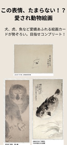
「今日のごはんは何にしよう?」「あ、あれ買い忘れた!」……毎日の献立作りやお買い物、本当にお疲れ様です。 「お買い物や食卓をもっとワクワクするものに変えられたら」そんな想いから、永谷園の公式アプリが誕生しました。 お買い物から食卓まで、家族との会話がもっと弾む「だんらん」の時間を、このアプリと一緒に楽しんでみませんか? 1.捨てちゃうレシートが「最高の体験」に!「ランクプログラム」 いつものお買い物でもらうレシート、そのまま捨てていませんか?永谷園の商品が含まれたレシートをパシャリと撮影して投稿するだけで、「おかげさまポイント」が貯まります。 貯めるほどランクアップ:ポイントが貯まると「ブロンズ」から「プラチナ」までランクが上がっていきます。 夢の特典に応募:ランクに応じて、日本文化に触れ合える特別なイベントへの参加など、永谷園ならではの「とっておきの体験」をご用意しています。 2.懐かしの「東海道五拾三次カード」が、手のひらで大復活! お茶づけの袋に入っていた、「東海道五拾三次カード」が、…
App details
What you can learn from 永谷園だんらんプログラム
Every shipping app on the App Store has gone through the same decisions you're working through right now: which screenshot goes first, what caption sits over it, which device frame to show, what color the background should be. The 7 screenshots above are 永谷園だんらんプログラム's answers to those questions — they're public, they're real, and they made it through Apple's review.
What the numbers say: 永谷園だんらんプログラム runs a light set with one background colour (#E4DCCC) carried across every screenshot — the listing reads as a single poster when the shots sit side by side in search results. The accent colour we picked up, #3C7C44, is the one to reuse for badges, arrows and highlighted words if you borrow this look. Hit Use this style to open the editor with these exact colours and drop your own screenshot in.
Notice the first screenshot in particular. It's the one users see in search results and on the product page, and it's where most apps spend their best caption and tightest design. Look at the proportion of background to phone, where the text sits, what one thing the image is trying to communicate.
Want to see how other Food & Drink apps approach the same problem? Browse more Food & Drink apps in the showcase.
Take what works into your own screenshots
Open LaunchShots and design your App Store & Google Play screenshots — pick a device frame, drop captions, ship in minutes. Free, in your browser.
Open the screenshot editor →Apps with a similar look
Closest background + accent colours among the listings we've analysed — useful when you want to see the same palette handled by a different team.