Screenshot style breakdown
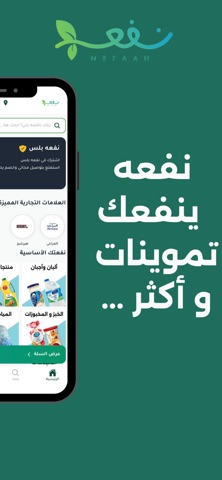
Sampled from 3 of Nefaah - نفعه's App Store screenshots — background, accent and theme, measured by LaunchShots (not something Apple publishes).
#1C6C5C bg
#3B8072
#6CC464 accent
#FFFFFF text
Screenshots


Icon palette
About this app
**نفعه - تطبيق توصيل البقالة المفضل لديك** اكتشف راحة توصيل البقالة مباشرة إلى بابك مع ونفعه. يوفر تطبيقنا تجربة تسوق سلسة مع مجموعة واسعة من المنتجات وخيارات الدفع السهلة. **الميزات:** - **مجموعة واسعة من المنتجات:** استكشف الفئات المختلفة بما في ذلك المنتجات الطازجة ومنتجات الألبان والوجبات الخفيفة والمزيد. - **واجهة مستخدم سهلة الاستخدام:** تصميم بديهي وسهل التنقل لتجربة تسوق خالية من المتاعب. - **مدفوعات آمنة:** الدفع بأمان من خلال بوابة الدفع. - **تتبع في الوقت الحقيقي:** تتبع طلبك في الوقت الفعلي من لحظة تقديمه حتى يتم تسليمه. - **عروض حصرية:** استمتع بالخصومات والعروض الخاصة المتاحة فقط لمستخدمي التطبيق. **كيفية العمل:** 1. **تصفح المنتجات:** تصفح مجموعة واسعة من المنتجات عبر الفئات المختلفة. 2. **أضف إلى السلة:** أضف العناصر المرغوبة إلى السلة. 3. **الدفع:** ادفع بأمان من خلال "Apple Pay & credit card" وقم بتقديم طلبك. 4. **التسليم:** احصل على طلبك موصلًا إلى بابك. حمل تطبيق…
App details
What you can learn from Nefaah - نفعه
Every shipping app on the App Store has gone through the same decisions you're working through right now: which screenshot goes first, what caption sits over it, which device frame to show, what color the background should be. The 3 screenshots above are Nefaah - نفعه's answers to those questions — they're public, they're real, and they made it through Apple's review.
What the numbers say: Nefaah - نفعه runs a dark set with one background colour (#1C6C5C) carried across every screenshot — the listing reads as a single poster when the shots sit side by side in search results. The accent colour we picked up, #6CC464, is the one to reuse for badges, arrows and highlighted words if you borrow this look. Hit Use this style to open the editor with these exact colours and drop your own screenshot in.
Notice the first screenshot in particular. It's the one users see in search results and on the product page, and it's where most apps spend their best caption and tightest design. Look at the proportion of background to phone, where the text sits, what one thing the image is trying to communicate.
Want to see how other Shopping apps approach the same problem? Browse more Shopping apps in the showcase.
Take what works into your own screenshots
Open LaunchShots and design your App Store & Google Play screenshots — pick a device frame, drop captions, ship in minutes. Free, in your browser.
Open the screenshot editor →Apps with a similar look
Closest background + accent colours among the listings we've analysed — useful when you want to see the same palette handled by a different team.