Chart position — tracked daily by LaunchShots
Screenshot style breakdown
Sampled from 4 of SMUDGE's App Store screenshots — background, accent and theme, measured by LaunchShots (not something Apple publishes).
#2C2C2C bg
#494949
#743C94 accent
#FFFFFF text
Reading the caption text from the screenshots in your browser…
Screenshots

Icon palette
About this app
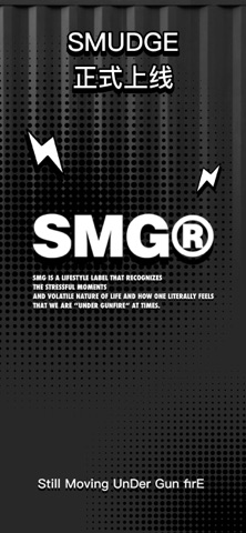
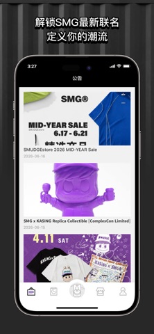
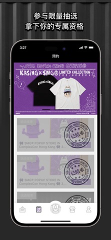
SMUDGE 是 SMG 官方应用,连接潮流、音乐与生活态度的全新平台。 源于歌手兼创作人林俊杰对街头文化、时尚潮流、音乐与艺术的独到见解,SMG(Still Moving UnDer Gun firE)自创立以来,不断融合军事、未来与复古等多元风格,跨越时装、运动、艺术与生活领域,定义属于亚洲的潮流 DNA。 SMUDGE 将这一切延伸至数字世界,打造一个集 品牌内容、活动参与与限量体验 于一体的官方平台。在这里,你不仅可以第一时间获取 SMG 最新动态与联名资讯,还能参与限定活动、解锁专属资格,感受属于 SMG 的独特文化表达。 除了是品牌名称,英文单字 “SMUDGE” 本身就别具意义- 它无时无刻提醒著:我们的信念及哲学将定义我们生活, 及在我们人生的图画中留下痕迹。(SMUDGE=污迹)。 SMG 用心在产品的设计里阐释这些信念,同时,SMG 的起源人及全体工作人员诚心希望支持并身穿 SMG 的朋友们会同样坚守这些伟大的信念及延伸力量。
App details
What you can learn from SMUDGE
Every shipping app on the App Store has gone through the same decisions you're working through right now: which screenshot goes first, what caption sits over it, which device frame to show, what color the background should be. The 4 screenshots above are SMUDGE's answers to those questions — they're public, they're real, and they made it through Apple's review.
What the numbers say: SMUDGE runs a dark set with one background colour (#2C2C2C) carried across every screenshot — the listing reads as a single poster when the shots sit side by side in search results. The accent colour we picked up, #743C94, is the one to reuse for badges, arrows and highlighted words if you borrow this look. Hit Use this style to open the editor with these exact colours and drop your own screenshot in.
Notice the first screenshot in particular. It's the one users see in search results and on the product page, and it's where most apps spend their best caption and tightest design. Look at the proportion of background to phone, where the text sits, what one thing the image is trying to communicate.
Want to see how other Shopping apps approach the same problem? Browse more Shopping apps in the showcase.
Take what works into your own screenshots
Open LaunchShots and design your App Store & Google Play screenshots — pick a device frame, drop captions, ship in minutes. Free, in your browser.
Open the screenshot editor →Apps with a similar look
Closest background + accent colours among the listings we've analysed — useful when you want to see the same palette handled by a different team.