Chart position — tracked daily by LaunchShots
Screenshot style breakdown
Sampled from 6 of GIRL: Spotkania In Real Life's App Store screenshots — background, accent and theme, measured by LaunchShots (not something Apple publishes).
#540C1C bg
#6B2E3B
#84545C accent
#FFFFFF text
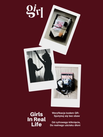
- #2Twoje miasto, Twoje pasje, Twoje GIRLs
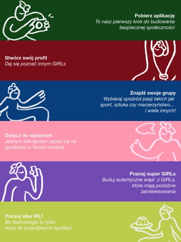
- #3e: z Pobierz aplikację = = To nasz pierwszy krok do (203 budowania bezpiecznej
- #4Don’t scroll, Let's go out,
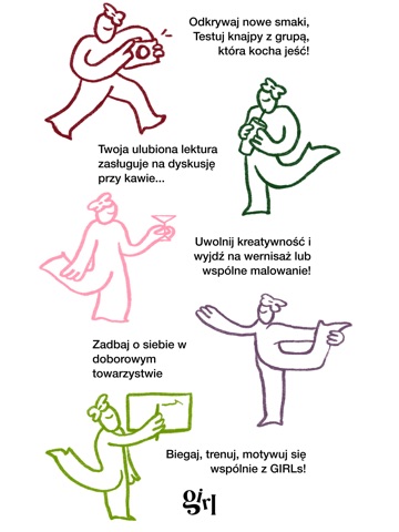
- #5e: Odkrywaj nowe smaki, = Testuj knajpy z grupą, 40% która kocha jeść!
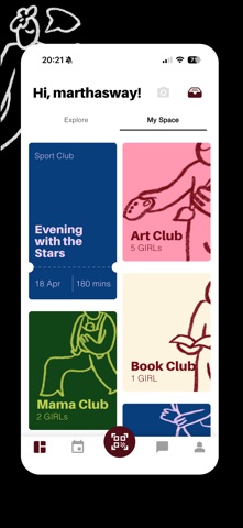
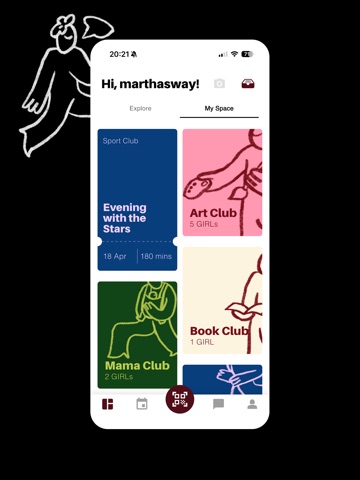
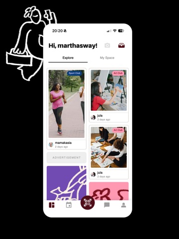
- #6Hi, marthasway! aa Explore My Space
Captions read from the screenshots (OCR, may contain small errors): 5 headlines, 8.8 words on average (longest 14).
Screenshots




iPad screenshots



Icon palette
About this app
Poznaj GIRL - Twoją nową przestrzeń do budowania prawdziwych więzi. GIRL (Girls In Real Life) to coś więcej niż aplikacja. To ruch społeczny stworzony przez kobiety dla kobiet, który pomaga pokonać barierę samotności i ułatwia nawiązywanie trwałych relacji. Naszą misją jest wykorzystanie technologii jako mostu, który zaprowadzi Cię prosto do realnych spotkań In Real Life. To miejsce dla KAŻDEJ z nas. W GIRL wierzymy, że siła tkwi w różnorodności, dlatego zapraszamy wszystkie kobiety - niezależnie od wieku, pochodzenia, ścieżki życiowej czy narodowości. Niezależnie od tego, czy dopiero wchodzisz w dorosłość, jesteś aktywną zawodowo profesjonalistką, mamą, czy seniorką - tutaj Twoja obecność ma znaczenie! DLACZEGO WARTO? • Bezpieczeństwo na pierwszym miejscu: Dzięki unikalnemu systemowi weryfikacji kodami QR i punktom zaufania, każda użytkowniczka może czuć się pewnie podczas spotkań IRL …
App details
What you can learn from GIRL: Spotkania In Real Life
Every shipping app on the App Store has gone through the same decisions you're working through right now: which screenshot goes first, what caption sits over it, which device frame to show, what color the background should be. The 16 screenshots above are GIRL: Spotkania In Real Life's answers to those questions — they're public, they're real, and they made it through Apple's review.
What the numbers say: GIRL: Spotkania In Real Life runs a mixed light-and-dark set where the background shifts from screenshot to screenshot (first shot #540C1C) — each image has to stand on its own, so the captions carry more of the story. The accent colour we picked up, #84545C, is the one to reuse for badges, arrows and highlighted words if you borrow this look. Hit Use this style to open the editor with these exact colours and drop your own screenshot in.
Notice the first screenshot in particular. It's the one users see in search results and on the product page, and it's where most apps spend their best caption and tightest design. Look at the proportion of background to phone, where the text sits, what one thing the image is trying to communicate.
Want to see how other Social Networking apps approach the same problem? Browse more Social Networking apps in the showcase.
Take what works into your own screenshots
Open LaunchShots and design your App Store & Google Play screenshots — pick a device frame, drop captions, ship in minutes. Free, in your browser.
Open the screenshot editor →Apps with a similar look
Closest background + accent colours among the listings we've analysed — useful when you want to see the same palette handled by a different team.