Screenshot changes — detected by LaunchShots
Screenshot style breakdown
Sampled from 5 of シンプル戦国's App Store screenshots — background, accent and theme, measured by LaunchShots (not something Apple publishes).
#FCFCFC bg
#DDDDDD
#3C5C7C accent
#111111 text
Screenshots
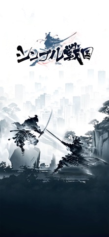

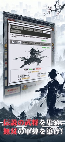


Icon palette
About this app
ざわめく現代都市に、戦国の豪傑たちが静かに姿を現した—— 『シンプル戦国』は、派手な立ち絵を排し、戦国の本質に立ち返った放置育成ゲーム。魅力的なストーリーで、武将たちと共に歩む日常にラクラク没入できる。 信長と肩を並べて戦い、信玄と共に策を練る——そんな夢を叶えてみないか?豪傑たちと出会い、道を共にし、あなただけの戦国絵巻を描こう! 【ワンタップで天下人】——放置するだけで名を上げる 両手はもう自由!放置で経験値アップ、放置で成長加速。無名の一兵卒から天下人へ、ラクラク駆け上がろう!織田信長、武田信玄、上杉謙信などの戦国の豪傑を募集し、あなただけの戦国への旅に出よう! 【現世の奇修行】——戦国を身をもって体感 武将たちのグループチャットに参加し、戦国からタイムスリップしてきた豪傑たちが現代でどう生きるかを間近で見届けよう。水墨画タッチのアートとチャット形式で、唯一無二の戦国日常を体験できる! 【諸国漫遊記】——知略で秘宝を奪取 手配書を受けて強敵を討伐し、諸国を漫游して伝説の遺跡を探索しよう!失われた秘…
App details
What you can learn from シンプル戦国
Every shipping app on the App Store has gone through the same decisions you're working through right now: which screenshot goes first, what caption sits over it, which device frame to show, what color the background should be. The 5 screenshots above are シンプル戦国's answers to those questions — they're public, they're real, and they made it through Apple's review.
What the numbers say: シンプル戦国 runs a light set with one background colour (#FCFCFC) carried across every screenshot — the listing reads as a single poster when the shots sit side by side in search results. The accent colour we picked up, #3C5C7C, is the one to reuse for badges, arrows and highlighted words if you borrow this look. Hit Use this style to open the editor with these exact colours and drop your own screenshot in.
Notice the first screenshot in particular. It's the one users see in search results and on the product page, and it's where most apps spend their best caption and tightest design. Look at the proportion of background to phone, where the text sits, what one thing the image is trying to communicate.
Want to see how other Games apps approach the same problem? Browse more Games apps in the showcase.
Take what works into your own screenshots
Open LaunchShots and design your App Store & Google Play screenshots — pick a device frame, drop captions, ship in minutes. Free, in your browser.
Open the screenshot editor →Apps with a similar look
Closest background + accent colours among the listings we've analysed — useful when you want to see the same palette handled by a different team.