Screenshot changes — detected by LaunchShots
Screenshot style breakdown
Sampled from 6 of Дед VPN - Супер Быстрый ВПН.'s App Store screenshots — background, accent and theme, measured by LaunchShots (not something Apple publishes).
#CCFC7C bg
#B3DD6D
#FCA404 accent
#111111 text
Screenshots


Icon palette
About this app
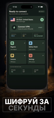
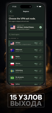
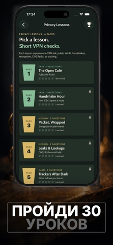
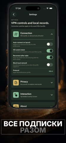
Безопасный интернет и полезные знания о приватности — в одном приложении. Подключайтесь быстро. Меняйте страны за секунды. Узнавайте, как работает цифровая защита, прямо в процессе использования. Это не просто туннель для трафика. Это площадка для формирования лучших привычек в интернете. Нажмите «Подключить» и сразу начните более безопасный сеанс без лишних действий. Четко видите свой статус. Мгновенно проверяйте активный сервер. Переходите от отключенного состояния к защищенному с помощью понятных и прямых элементов управления, которые не отнимают время. Интерфейс остается сфокусированным, чтобы вы могли действовать быстро и сохранять контроль. Выбор сервера должен быть простым, а не спрятанным в меню. Просматривайте локации по странам. Фильтруйте список, когда важны скорость и ясность. Добавляйте в избранное места, которые используете чаще всего. Быстро возвращайтесь к надежным вар…
App details
What you can learn from Дед VPN - Супер Быстрый ВПН.
Every shipping app on the App Store has gone through the same decisions you're working through right now: which screenshot goes first, what caption sits over it, which device frame to show, what color the background should be. The 7 screenshots above are Дед VPN - Супер Быстрый ВПН.'s answers to those questions — they're public, they're real, and they made it through Apple's review.
What the numbers say: Дед VPN - Супер Быстрый ВПН. runs a mixed light-and-dark set where the background shifts from screenshot to screenshot (first shot #CCFC7C) — each image has to stand on its own, so the captions carry more of the story. The accent colour we picked up, #FCA404, is the one to reuse for badges, arrows and highlighted words if you borrow this look. Hit Use this style to open the editor with these exact colours and drop your own screenshot in.
Notice the first screenshot in particular. It's the one users see in search results and on the product page, and it's where most apps spend their best caption and tightest design. Look at the proportion of background to phone, where the text sits, what one thing the image is trying to communicate.
Want to see how other Utilities apps approach the same problem? Browse more Utilities apps in the showcase.
Take what works into your own screenshots
Open LaunchShots and design your App Store & Google Play screenshots — pick a device frame, drop captions, ship in minutes. Free, in your browser.
Open the screenshot editor →Apps with a similar look
Closest background + accent colours among the listings we've analysed — useful when you want to see the same palette handled by a different team.