Chart position — tracked daily by LaunchShots
Screenshot style breakdown
Sampled from 6 of Trưa Nay Ăn Gì?'s App Store screenshots — background, accent and theme, measured by LaunchShots (not something Apple publishes).
#F4F4EC bg
#D6D6CF
#FC6404 accent
#111111 text
Screenshots

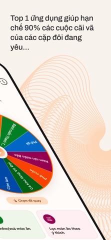


iPad screenshots


Icon palette
About this app
BẠN MẤT BAO LÂU MỖI NGÀY ĐỂ TRẢ LỜI CÂU HỎI "HÔM NAY ĂN GÌ?" What For Lunch giúp bạn quyết định bữa trưa chỉ trong vài giây với vòng quay may mắn đầy màu sắc và thú vị! Đừng để việc chọn món trở thành nỗi đau đầu mỗi ngày. Chỉ cần một cú chạm, quay và thưởng thức ngay bữa trưa của bạn. TÍNH NĂNG NỔI BẬT: ● THỰC ĐƠN ĐA DẠNG: Vòng quay tích hợp sẵn 87 món ăn Việt Nam đặc trưng từ khắp ba miền Bắc - Trung - Nam. ● BỘ LỌC THÔNG MINH: Dễ dàng tìm kiếm món ăn theo vùng miền, giá tiền, mức năng lượng hoặc tùy chọn ăn ngoài/nấu tại nhà. ● THÔNG TIN CHI TIẾT: Cung cấp mô tả món ăn, giá tham khảo và hàm lượng calo giúp bạn dễ dàng cân đối dinh dưỡng. ● KẾT NỐI BẢN ĐỒ: Tìm ngay các quán ăn xung quanh bạn thông qua Apple Maps hoặc Google Maps chỉ với một thao tác. ● GHI NHỚ TIỆN LỢI: Lưu lại lịch sử ăn uống trong 30 ngày để bạn dễ dàng theo dõi và đổi vị cho những ngày tiếp theo. ● TRẢI NGHIỆM M…
App details
What you can learn from Trưa Nay Ăn Gì?
Every shipping app on the App Store has gone through the same decisions you're working through right now: which screenshot goes first, what caption sits over it, which device frame to show, what color the background should be. The 10 screenshots above are Trưa Nay Ăn Gì?'s answers to those questions — they're public, they're real, and they made it through Apple's review.
What the numbers say: Trưa Nay Ăn Gì? runs a light set where the background shifts from screenshot to screenshot (first shot #F4F4EC) — each image has to stand on its own, so the captions carry more of the story. The accent colour we picked up, #FC6404, is the one to reuse for badges, arrows and highlighted words if you borrow this look. Hit Use this style to open the editor with these exact colours and drop your own screenshot in.
Notice the first screenshot in particular. It's the one users see in search results and on the product page, and it's where most apps spend their best caption and tightest design. Look at the proportion of background to phone, where the text sits, what one thing the image is trying to communicate.
Want to see how other Food & Drink apps approach the same problem? Browse more Food & Drink apps in the showcase.
Take what works into your own screenshots
Open LaunchShots and design your App Store & Google Play screenshots — pick a device frame, drop captions, ship in minutes. Free, in your browser.
Open the screenshot editor →Apps with a similar look
Closest background + accent colours among the listings we've analysed — useful when you want to see the same palette handled by a different team.