Chart position — tracked daily by LaunchShots
Screenshot changes — detected by LaunchShots
Screenshot style breakdown
Sampled from 6 of Drone Weather Forecast: Погода's App Store screenshots — background, accent and theme, measured by LaunchShots (not something Apple publishes).
#040404 bg
#272727
#0C6434 accent
#FFFFFF text
Screenshots




iPad screenshots



Icon palette
About this app
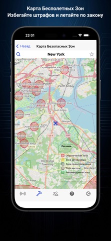
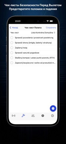
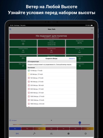
Можно ли безопасно летать на дроне прямо сейчас? Drone Weather Forecast отвечает одним цветом — зелёным, жёлтым или красным — с учётом ограничений именно вашего дрона. Выберите модель из 79 профилей (DJI, Autel, Parrot, Fimi, Potensic, Holy Stone, Ryze и другие), и каждый час прогноза сравнивается с её пределами по ветру и температуре. Или задайте свои. БЕСПЛАТНО, БЕЗ РЕКЛАМЫ • Почасовой прогноз на 7 дней: температура, осадки, облачность, видимость, восход и закат • Скорость, порывы и направление ветра по часам • Индекс KP: геомагнитные бури, которые мешают GPS и компасу • Видимые спутники GPS, ГЛОНАСС, Galileo и BeiDou в вашей точке • Карта запретных зон с GEO-зонами DJI — работает офлайн • Свои предполётные чек-листы и история полётов • Сообщество пилотов: места для полётов и аэрофото • км/ч, м/с, mph или узлы · °C или °F · метры или футы • Доступно на 16 языках PRO — ПЛАТИТЕ ОДИН …
App details
What you can learn from Drone Weather Forecast: Погода
Every shipping app on the App Store has gone through the same decisions you're working through right now: which screenshot goes first, what caption sits over it, which device frame to show, what color the background should be. The 14 screenshots above are Drone Weather Forecast: Погода's answers to those questions — they're public, they're real, and they made it through Apple's review.
What the numbers say: Drone Weather Forecast: Погода runs a dark set with one background colour (#040404) carried across every screenshot — the listing reads as a single poster when the shots sit side by side in search results. The accent colour we picked up, #0C6434, is the one to reuse for badges, arrows and highlighted words if you borrow this look. Hit Use this style to open the editor with these exact colours and drop your own screenshot in.
Notice the first screenshot in particular. It's the one users see in search results and on the product page, and it's where most apps spend their best caption and tightest design. Look at the proportion of background to phone, where the text sits, what one thing the image is trying to communicate.
Want to see how other Weather apps approach the same problem? Browse more Weather apps in the showcase.
Take what works into your own screenshots
Open LaunchShots and design your App Store & Google Play screenshots — pick a device frame, drop captions, ship in minutes. Free, in your browser.
Open the screenshot editor →Apps with a similar look
Closest background + accent colours among the listings we've analysed — useful when you want to see the same palette handled by a different team.