Screenshot style breakdown
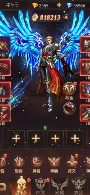
Sampled from 6 of 起原神界 レジェンズ・オブ・ファンタジー:ブレイブ X's App Store screenshots — background, accent and theme, measured by LaunchShots (not something Apple publishes).
#240C04 bg
#422E27
#6C4C3C accent
#FFFFFF text
Screenshots


Icon palette
About this app
◆ 世界は、今また試される 太古の神話大陸に罪竜が再臨した。 憎悪と絶望を糧に成長し続ける敵を前に、 「双華」の力を受け継いだ者だけが戦える。 ◆ 放置しながら、でも本気で強くなれる ゲームを閉じても仲間たちは戦い続ける。 帰ってきたときには素材が山積み—— サクサク育成、でも戦略は本格派。 属性相性・スキル連携・陣形を駆使し、 頭脳でも力でも頂点を目指せ。 ◆ 推しを、最強に育てる自由 華麗な限定コスチュームから伝説武具まで、 あなたの推しキャラだけの物語を作ろう。 育成に「正解」はない。あるのは、あなたのスタイルだけ。 ◆ 同盟で共に、世界の頂点へ 最大80人のギルド共闘、ランキング戦、 大型レイドボス—— 一人じゃ届かない景色が、仲間と一緒なら見える。 ◆ 今始めるなら、これ以上ない 新規プレイヤー向けの豪華スタートダッシュ報酬を用意。 始めたその日から強力なパーティが作れ、 毎日のログインボーナスでサクサク育成が進む。
App details
What you can learn from 起原神界 レジェンズ・オブ・ファンタジー:ブレイブ X
Every shipping app on the App Store has gone through the same decisions you're working through right now: which screenshot goes first, what caption sits over it, which device frame to show, what color the background should be. The 6 screenshots above are 起原神界 レジェンズ・オブ・ファンタジー:ブレイブ X's answers to those questions — they're public, they're real, and they made it through Apple's review.
What the numbers say: 起原神界 レジェンズ・オブ・ファンタジー:ブレイブ X runs a mixed light-and-dark set where the background shifts from screenshot to screenshot (first shot #240C04) — each image has to stand on its own, so the captions carry more of the story. The accent colour we picked up, #6C4C3C, is the one to reuse for badges, arrows and highlighted words if you borrow this look. Hit Use this style to open the editor with these exact colours and drop your own screenshot in.
Notice the first screenshot in particular. It's the one users see in search results and on the product page, and it's where most apps spend their best caption and tightest design. Look at the proportion of background to phone, where the text sits, what one thing the image is trying to communicate.
Want to see how other Games apps approach the same problem? Browse more Games apps in the showcase.
Take what works into your own screenshots
Open LaunchShots and design your App Store & Google Play screenshots — pick a device frame, drop captions, ship in minutes. Free, in your browser.
Open the screenshot editor →Apps with a similar look
Closest background + accent colours among the listings we've analysed — useful when you want to see the same palette handled by a different team.