Chart position — tracked daily by LaunchShots
Screenshot changes — detected by LaunchShots
Screenshot style breakdown
Sampled from 6 of Kazık Yer Miyim?'s App Store screenshots — background, accent and theme, measured by LaunchShots (not something Apple publishes).
#FCFCFC bg
#DDDDDD
#4C4414 accent
#111111 text
Screenshots
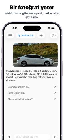
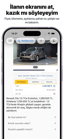


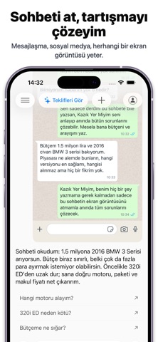


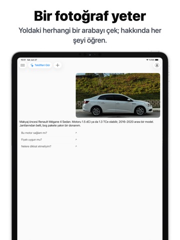
iPad screenshots




Icon palette
About this app
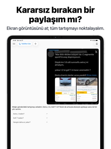
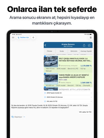
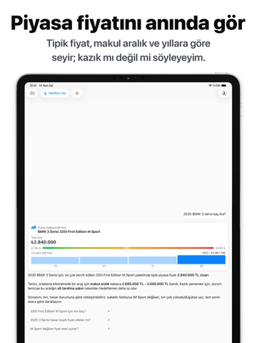
Araba alırken kazıklanmaktan mı korkuyorsunuz? Yapay zeka ile ilan, kronik sorun, fiyat, görsel ekspertiz ve dahasına anında ulaş. Asla kazık yeme. Danışmanın Cebinde. Kazık Yer Miyim? Türkiye'de ikinci el araba alacakların satın alım öncesi başvurduğu yapay zeka destek platformu. Beğendiğin bir ilanı paylaş; Yapay zeka saniyeler içinde fiyat değerlendirmesi, hasar/değişen tespiti, açıklama tutarsızlıkları ve "kazık risk skoru" içeren uzman raporu hazırlasın. NASIL ÇALIŞIR 1. Beğendiğin ilanın, yoldaki bir arabanın, herhangi bir sohbetteki tartışmanın, bir sosyal medya gönderisinin veya içinde araba geçen herhangi bir şeyin fotoğrafını yolla 2. Yapay zeka piyasadaki benzer araçlarla fiyatı karşılaştırsın 3. Fotoğraflardan boya, değişen ve hasar işaretlerini tespit etsin 4. Açıklamadaki çelişkileri ve modele özgü kronik sorunları işaret etsin NE SUNAR • Fiyat analizi — piyasadaki benz…
App details
What you can learn from Kazık Yer Miyim?
Every shipping app on the App Store has gone through the same decisions you're working through right now: which screenshot goes first, what caption sits over it, which device frame to show, what color the background should be. The 16 screenshots above are Kazık Yer Miyim?'s answers to those questions — they're public, they're real, and they made it through Apple's review.
What the numbers say: Kazık Yer Miyim? runs a light set with one background colour (#FCFCFC) carried across every screenshot — the listing reads as a single poster when the shots sit side by side in search results. The accent colour we picked up, #4C4414, is the one to reuse for badges, arrows and highlighted words if you borrow this look. Hit Use this style to open the editor with these exact colours and drop your own screenshot in.
Notice the first screenshot in particular. It's the one users see in search results and on the product page, and it's where most apps spend their best caption and tightest design. Look at the proportion of background to phone, where the text sits, what one thing the image is trying to communicate.
Want to see how other Utilities apps approach the same problem? Browse more Utilities apps in the showcase.
Take what works into your own screenshots
Open LaunchShots and design your App Store & Google Play screenshots — pick a device frame, drop captions, ship in minutes. Free, in your browser.
Open the screenshot editor →Apps with a similar look
Closest background + accent colours among the listings we've analysed — useful when you want to see the same palette handled by a different team.