Chart position — tracked daily by LaunchShots
Screenshot style breakdown
Sampled from 6 of Shagulin's App Store screenshots — background, accent and theme, measured by LaunchShots (not something Apple publishes).
#040404 bg
#272727
#C48C74 accent
#FFFFFF text
Reading the caption text from the screenshots in your browser…
Screenshots




Icon palette
About this app
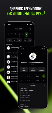
SHAGULIN — программы тренировок в зале от Виктора Шагулина, известного тренера и автора программ, по которым уже получены реальные результаты до/после. Здесь есть всё, чтобы не гадать, что делать в зале, правильно выполнять упражнения и видеть прогресс: • 10+ готовых авторских программ тренировок • понятный план на каждый тренировочный день • продуманная периодизация • короткие видео с техникой выполнения упражнений • дневник тренировок: вес, повторения, подходы и заметки • история каждого упражнения и графики прогресса • замеры тела и контроль изменений • быстрая замена упражнения на подходящий аналог • AI Виктор — ответы на вопросы по питанию, тренировкам и технике • база знаний без лишней воды • работа без интернета ПРОГРАММЫ ОТ ВИКТОРА ШАГУЛИНА Тренируйся по готовой системе, а не по случайному набору упражнений. Каждая программа задаёт структуру недели, порядок упражнений, диапаз…
App details
What you can learn from Shagulin
Every shipping app on the App Store has gone through the same decisions you're working through right now: which screenshot goes first, what caption sits over it, which device frame to show, what color the background should be. The 7 screenshots above are Shagulin's answers to those questions — they're public, they're real, and they made it through Apple's review.
What the numbers say: Shagulin runs a dark set with one background colour (#040404) carried across every screenshot — the listing reads as a single poster when the shots sit side by side in search results. The accent colour we picked up, #C48C74, is the one to reuse for badges, arrows and highlighted words if you borrow this look. Hit Use this style to open the editor with these exact colours and drop your own screenshot in.
Notice the first screenshot in particular. It's the one users see in search results and on the product page, and it's where most apps spend their best caption and tightest design. Look at the proportion of background to phone, where the text sits, what one thing the image is trying to communicate.
Want to see how other Health & Fitness apps approach the same problem? Browse more Health & Fitness apps in the showcase.
Take what works into your own screenshots
Open LaunchShots and design your App Store & Google Play screenshots — pick a device frame, drop captions, ship in minutes. Free, in your browser.
Open the screenshot editor →Apps with a similar look
Closest background + accent colours among the listings we've analysed — useful when you want to see the same palette handled by a different team.