Chart position — tracked daily by LaunchShots
Screenshot changes — detected by LaunchShots
Screenshot style breakdown
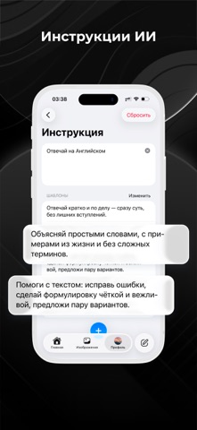
Sampled from 6 of ДедИИ: ИИ чат на русском's App Store screenshots — background, accent and theme, measured by LaunchShots (not something Apple publishes).
#040404 bg
#272727
#346C9C accent
#FFFFFF text
Reading the caption text from the screenshots in your browser…
Screenshots




Icon palette
About this app
Наше ИИ-приложение на базе передовых нейросетей помогает решать задачи по работе и учебе: пишет тексты, объясняет сложные темы, ищет информацию, генерирует идеи. А также служит незаменимым помощником для повседневной жизни и творчества. ДОСТУП К НЕЙРОСЕТЯМ СРАЗУ ПОСЛЕ УСТАНОВКИ В отличие от многих сложных сервисов, где нужно регистрироваться, подтверждать аккаунт или настраивать доступ, с ДедИИ ты получишь максимально простой и быстрый доступ к AI: — без регистрации; — без смены региона. ОСНОВНЫЕ ФУНКЦИИ — Поиск, проверка и структурирование информации. — Написание, перевод и редактирование текстов. — Составление отчетов, инструкций и резюме. — Генерирование идей и формулировок. — Планирование повседневных задач. — Объяснение тем и понятий. — Общение и переписка с ИИ. ПОДХОДИТ ВСЕМ Ты освоишь приложение, даже если ранее никогда не пользовался другими AI. Наши пользователи: — школьник…
App details
What you can learn from ДедИИ: ИИ чат на русском
Every shipping app on the App Store has gone through the same decisions you're working through right now: which screenshot goes first, what caption sits over it, which device frame to show, what color the background should be. The 10 screenshots above are ДедИИ: ИИ чат на русском's answers to those questions — they're public, they're real, and they made it through Apple's review.
What the numbers say: ДедИИ: ИИ чат на русском runs a dark set with one background colour (#040404) carried across every screenshot — the listing reads as a single poster when the shots sit side by side in search results. The accent colour we picked up, #346C9C, is the one to reuse for badges, arrows and highlighted words if you borrow this look. Hit Use this style to open the editor with these exact colours and drop your own screenshot in.
Notice the first screenshot in particular. It's the one users see in search results and on the product page, and it's where most apps spend their best caption and tightest design. Look at the proportion of background to phone, where the text sits, what one thing the image is trying to communicate.
Want to see how other Productivity apps approach the same problem? Browse more Productivity apps in the showcase.
Take what works into your own screenshots
Open LaunchShots and design your App Store & Google Play screenshots — pick a device frame, drop captions, ship in minutes. Free, in your browser.
Open the screenshot editor →Apps with a similar look
Closest background + accent colours among the listings we've analysed — useful when you want to see the same palette handled by a different team.