Screenshot style breakdown
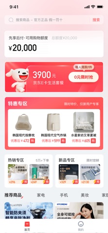
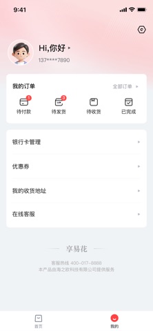
Sampled from 4 of 享易花-购物,先享后付's App Store screenshots — background, accent and theme, measured by LaunchShots (not something Apple publishes).
#FCFCFC bg
#DDDDDD
#FC4454 accent
#111111 text
Screenshots


Icon palette
About this app
先享后付,购物更轻松!享易花商城海量好物等你来挑 享易花——让购物更轻松、更便捷的品质电商平台。 【平台定位】 享易花是一家专注于为用户提供优质生活用品的纯电商购物平台。我们严选数码家电、家居日用、美妆个护等全品类商品,致力于打造“好货不贵、先用后付”的新型购物体验。 【支付方式】 为了满足不同用户的支付习惯,平台提供两种安全便捷的支付方式: 银行卡快捷支付:支持主流银行卡余额支付,流程简单,即时到账。 先享后付(商户补贴模式):这是我们联合平台商户推出的购物优惠方式。用户在完成实名认证并通过审核后,即可享受“先收货、后付款”的服务,全程无任何利息、手续费及提现功能,旨在降低购物压力,提升消费体验。 【合规与安全】 享易花严格遵守国家相关法律法规,所有交易均为真实的商品买卖行为。我们采用多重数据加密技术,全方位保护用户隐私与资金安全。
App details
What you can learn from 享易花-购物,先享后付
Every shipping app on the App Store has gone through the same decisions you're working through right now: which screenshot goes first, what caption sits over it, which device frame to show, what color the background should be. The 4 screenshots above are 享易花-购物,先享后付's answers to those questions — they're public, they're real, and they made it through Apple's review.
What the numbers say: 享易花-购物,先享后付 runs a light set with one background colour (#FCFCFC) carried across every screenshot — the listing reads as a single poster when the shots sit side by side in search results. The accent colour we picked up, #FC4454, is the one to reuse for badges, arrows and highlighted words if you borrow this look. Hit Use this style to open the editor with these exact colours and drop your own screenshot in.
Notice the first screenshot in particular. It's the one users see in search results and on the product page, and it's where most apps spend their best caption and tightest design. Look at the proportion of background to phone, where the text sits, what one thing the image is trying to communicate.
Want to see how other Shopping apps approach the same problem? Browse more Shopping apps in the showcase.
Take what works into your own screenshots
Open LaunchShots and design your App Store & Google Play screenshots — pick a device frame, drop captions, ship in minutes. Free, in your browser.
Open the screenshot editor →Apps with a similar look
Closest background + accent colours among the listings we've analysed — useful when you want to see the same palette handled by a different team.