Chart position — tracked daily by LaunchShots
Screenshot style breakdown
Sampled from 6 of NIGERU's App Store screenshots — background, accent and theme, measured by LaunchShots (not something Apple publishes).
#549CFC bg
#4989DD
#0C843C accent
#111111 text
Screenshots





Icon palette
About this app
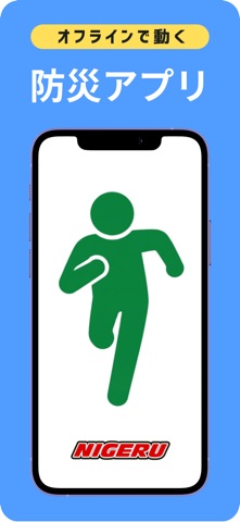
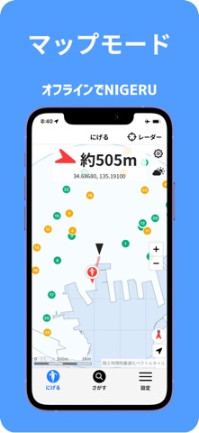
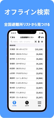
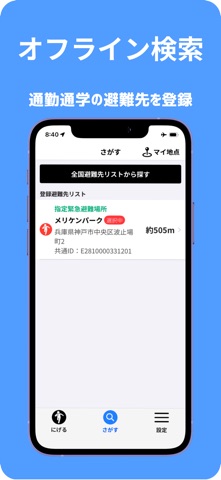
■ 防災アプリ『NIGERU』の概要 通信途絶時でも、命を守る行動をサポート。 『NIGERU』は、災害発生時にネットが繋がらない状況(オフライン)であっても、スマートフォン端末内の位置情報を活用して最寄りの避難先を自動で優先検 索し、コンパス機能で誘導する防災アプリです。 ■ 『NIGERU』の主な特長と機能 防災機能(オフライン対応) 通信遮断時でも、端末の位置情報をもとに周辺の避難先を自動で優先検索。コンパス機能で直感的な避難行動をサポートします。 練習・日常利用機能 普段から通勤・通学路の確認や家族・友人との避難練習、職場での訓練に活用可能。「マイ地点登録」により、日常から備える習慣を作ります。 気象情報配信(※オンライン時のみ) 現在地および避難先周辺の最新気象情報をリアルタイムで配信・表示します。 避難者受付支援システム(受付機能) 身近なICカード(マイナンバーカード、交通系ICカード、運転免許証、社員証、ホワイト無地カード等)とスマートフォンのみで、現場での避難者受付を完結。 通信環境がない状況でも動作し…
App details
What you can learn from NIGERU
Every shipping app on the App Store has gone through the same decisions you're working through right now: which screenshot goes first, what caption sits over it, which device frame to show, what color the background should be. The 10 screenshots above are NIGERU's answers to those questions — they're public, they're real, and they made it through Apple's review.
What the numbers say: NIGERU runs a light set with one background colour (#549CFC) carried across every screenshot — the listing reads as a single poster when the shots sit side by side in search results. The accent colour we picked up, #0C843C, is the one to reuse for badges, arrows and highlighted words if you borrow this look. Hit Use this style to open the editor with these exact colours and drop your own screenshot in.
Notice the first screenshot in particular. It's the one users see in search results and on the product page, and it's where most apps spend their best caption and tightest design. Look at the proportion of background to phone, where the text sits, what one thing the image is trying to communicate.
Want to see how other Weather apps approach the same problem? Browse more Weather apps in the showcase.
Take what works into your own screenshots
Open LaunchShots and design your App Store & Google Play screenshots — pick a device frame, drop captions, ship in minutes. Free, in your browser.
Open the screenshot editor →Apps with a similar look
Closest background + accent colours among the listings we've analysed — useful when you want to see the same palette handled by a different team.