Chart position — tracked daily by LaunchShots
Screenshot style breakdown
Sampled from 3 of 测测星座-找到你的专属星空's App Store screenshots — background, accent and theme, measured by LaunchShots (not something Apple publishes).
#040424 bg
#272742
#544474 accent
#FFFFFF text
Reading the caption text from the screenshots in your browser…
Screenshots

Icon palette
About this app
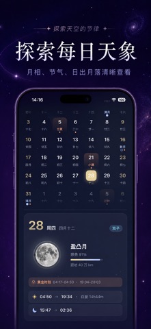
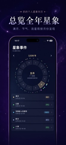
星象万年历 —— 一款融合万年历与天文科普的实用工具 App。 【万年历 · 公农历一体】 • 公历与农历无缝切换,支持百年万年历 • 显示二十四节气、传统节日、法定假日 • 标注重要星象日期,如月圆、新月、流星雨等 • 点击任意日期,查看当日农历信息与节气详情 【星象事件 · 天文年历】 • 汇集月相(满月/新月/上下弦)、月食日食、流星雨、行星冲日等重要天象 • 精准的事件时间与天文学解释 • 最佳观测建议,帮助你不错过任何壮观天象 【行星位置 · 天文计算工具】 • 实时显示太阳、月球及八大行星当前黄道经度 • 支持任意历史/未来时刻的行星位置查询 • 直观的太阳系示意图,了解行星运行规律 • 基于精密天文算法,数据可靠准确 【简洁美观 · 开箱即用】 • 完全免费,无广告,无内购 • iOS 17 原生体验,流畅极速 无论你是天文爱好者、学生,还是想了解中华传统历法的用户,都是你的理想选择。
App details
What you can learn from 测测星座-找到你的专属星空
Every shipping app on the App Store has gone through the same decisions you're working through right now: which screenshot goes first, what caption sits over it, which device frame to show, what color the background should be. The 3 screenshots above are 测测星座-找到你的专属星空's answers to those questions — they're public, they're real, and they made it through Apple's review.
What the numbers say: 测测星座-找到你的专属星空 runs a dark set with one background colour (#040424) carried across every screenshot — the listing reads as a single poster when the shots sit side by side in search results. The accent colour we picked up, #544474, is the one to reuse for badges, arrows and highlighted words if you borrow this look. Hit Use this style to open the editor with these exact colours and drop your own screenshot in.
Notice the first screenshot in particular. It's the one users see in search results and on the product page, and it's where most apps spend their best caption and tightest design. Look at the proportion of background to phone, where the text sits, what one thing the image is trying to communicate.
Want to see how other Reference apps approach the same problem? Browse more Reference apps in the showcase.
Take what works into your own screenshots
Open LaunchShots and design your App Store & Google Play screenshots — pick a device frame, drop captions, ship in minutes. Free, in your browser.
Open the screenshot editor →Apps with a similar look
Closest background + accent colours among the listings we've analysed — useful when you want to see the same palette handled by a different team.