Chart position — tracked daily by LaunchShots
Screenshot style breakdown
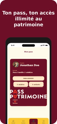
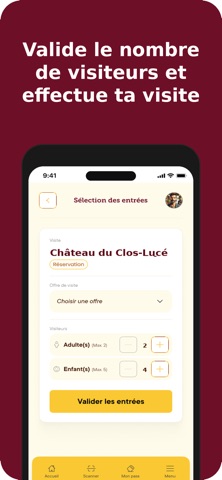
Sampled from 5 of Pass Patrimoine's App Store screenshots — background, accent and theme, measured by LaunchShots (not something Apple publishes).
#6C0C24 bg
#802E42
#FCCC34 accent
#FFFFFF text
Screenshots


Icon palette
About this app
Vous détenez un Pass Patrimoine ? L’application Pass Patrimoine est essentielle pour vous permettre de réaliser vos visites, partout en France. Elle vous permet, à l’arrivée sur un site patrimonial, de scanner le QR Code Pass Patrimoine et de valider votre entrée. Le Pass Patrimoine a été développé à l’initiative de la Fondation du patrimoine, afin de réinventer la découverte de nos trésors culturels et de vous ouvrir les portes du patrimoine. Via un abonnement, vous pouvez visiter des sites patrimoniaux d’exception, partout en France. Chaque sortie devient ainsi un moment vécu ensemble, en famille ou entre amis, utile et porteur de sens, au service des lieux, des relations humaines, des territoires et de l’intérêt général. Quatre formules sont proposées : Solo, Duo, Famille 1 adulte et Famille 2 adultes. Si vous n’avez pas encore de Pass Patrimoine, trouvez la formule qui vous convie…
App details
What you can learn from Pass Patrimoine
Every shipping app on the App Store has gone through the same decisions you're working through right now: which screenshot goes first, what caption sits over it, which device frame to show, what color the background should be. The 5 screenshots above are Pass Patrimoine's answers to those questions — they're public, they're real, and they made it through Apple's review.
What the numbers say: Pass Patrimoine runs a dark set with one background colour (#6C0C24) carried across every screenshot — the listing reads as a single poster when the shots sit side by side in search results. The accent colour we picked up, #FCCC34, is the one to reuse for badges, arrows and highlighted words if you borrow this look. Hit Use this style to open the editor with these exact colours and drop your own screenshot in.
Notice the first screenshot in particular. It's the one users see in search results and on the product page, and it's where most apps spend their best caption and tightest design. Look at the proportion of background to phone, where the text sits, what one thing the image is trying to communicate.
Want to see how other Travel apps approach the same problem? Browse more Travel apps in the showcase.
Take what works into your own screenshots
Open LaunchShots and design your App Store & Google Play screenshots — pick a device frame, drop captions, ship in minutes. Free, in your browser.
Open the screenshot editor →Apps with a similar look
Closest background + accent colours among the listings we've analysed — useful when you want to see the same palette handled by a different team.