Chart position — tracked daily by LaunchShots
Screenshot style breakdown
Sampled from 6 of NowMee 懂你's App Store screenshots — background, accent and theme, measured by LaunchShots (not something Apple publishes).
#FCFCFC bg
#DDDDDD
#8CDCB4 accent
#111111 text
Reading the caption text from the screenshots in your browser…
Screenshots


iPad screenshots


Icon palette
About this app
[ Mee — 你的专属赛博嘴替 ] 专属于你的Mee,时刻陪伴。 Mee从读懂你开始,在日常对话中记住你的每一面,再为你找到对的TA。 [ 赛博嘴替,出谋划策 ] 破冰、打探,Mee都在行。 不知道怎么开口? Mee帮你想好开场白,替你探探对方的态度,让每一次主动都不再尴尬。 [ 同频的人就在这里,遇见真实的TA ] 自然语言精准匹配,找到最想找的人。 NowMee不靠外貌和简历,Mee会根据你的记忆和兴趣,找到真正和你同频的人。 还可以逛逛广场,从大家分享的日常动态里,发现让你感兴趣的TA。 [ 记住你的每一面 ] 测试、书影音、日常聊天,都能成为Mee了解你的方式。 还有Mee的多种好奇卡片,帮你随手记录每天的新发现,让Mee一点点更懂你。 [ 展示你的独特Vibe ] 根据你的喜好和风格,自由装扮NowMee名片, 打造属于你的个性空间,展示不被定义的有趣。 先遇见懂你的Mee,再遇见对的人。
App details
What you can learn from NowMee 懂你
Every shipping app on the App Store has gone through the same decisions you're working through right now: which screenshot goes first, what caption sits over it, which device frame to show, what color the background should be. The 14 screenshots above are NowMee 懂你's answers to those questions — they're public, they're real, and they made it through Apple's review.
What the numbers say: NowMee 懂你 runs a light set with one background colour (#FCFCFC) carried across every screenshot — the listing reads as a single poster when the shots sit side by side in search results. The accent colour we picked up, #8CDCB4, is the one to reuse for badges, arrows and highlighted words if you borrow this look. Hit Use this style to open the editor with these exact colours and drop your own screenshot in.
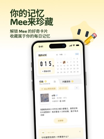
Notice the first screenshot in particular. It's the one users see in search results and on the product page, and it's where most apps spend their best caption and tightest design. Look at the proportion of background to phone, where the text sits, what one thing the image is trying to communicate.
Want to see how other Social Networking apps approach the same problem? Browse more Social Networking apps in the showcase.
Take what works into your own screenshots
Open LaunchShots and design your App Store & Google Play screenshots — pick a device frame, drop captions, ship in minutes. Free, in your browser.
Open the screenshot editor →Apps with a similar look
Closest background + accent colours among the listings we've analysed — useful when you want to see the same palette handled by a different team.