Screenshot style breakdown
Sampled from 6 of DealyFeely's App Store screenshots — background, accent and theme, measured by LaunchShots (not something Apple publishes).
#ECF4F4 bg
#CFD6D6
#FCE47C accent
#111111 text
Screenshots




iPad screenshots


Icon palette
About this app
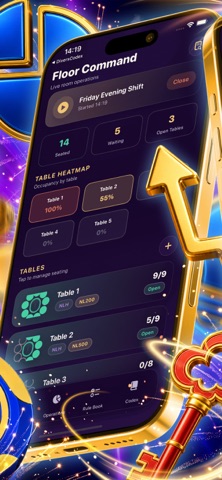
DealyFeely is the professional operations console for poker room and card club managers. It brings every part of running the floor into one calm, focused workspace, so you can spend less time juggling notes and more time managing the room. Command your floor in real time. Build a visual table map, set games and limits, and drag waiting players straight onto open seats. A live occupancy heatmap shows you which tables are full and which need attention at a glance, and a one tap shift snapshot gives you a clean handover report in seconds. Keep the money tight. Reconcile the chip bank from the start of the shift to the end and instantly spot any discrepancy. Track rake against dealer wages and operating costs to see the true profitability of every shift. Stay in control of the rules. Resolve disputes with a step by step ruling wizard that walks you from facts to a clear, logged decision,…
App details
What you can learn from DealyFeely
Every shipping app on the App Store has gone through the same decisions you're working through right now: which screenshot goes first, what caption sits over it, which device frame to show, what color the background should be. The 20 screenshots above are DealyFeely's answers to those questions — they're public, they're real, and they made it through Apple's review.
What the numbers say: DealyFeely runs a mixed light-and-dark set where the background shifts from screenshot to screenshot (first shot #ECF4F4) — each image has to stand on its own, so the captions carry more of the story. The accent colour we picked up, #FCE47C, is the one to reuse for badges, arrows and highlighted words if you borrow this look. Hit Use this style to open the editor with these exact colours and drop your own screenshot in.
Notice the first screenshot in particular. It's the one users see in search results and on the product page, and it's where most apps spend their best caption and tightest design. Look at the proportion of background to phone, where the text sits, what one thing the image is trying to communicate.
Want to see how other Business apps approach the same problem? Browse more Business apps in the showcase.
Take what works into your own screenshots
Open LaunchShots and design your App Store & Google Play screenshots — pick a device frame, drop captions, ship in minutes. Free, in your browser.
Open the screenshot editor →Apps with a similar look
Closest background + accent colours among the listings we've analysed — useful when you want to see the same palette handled by a different team.