Chart position — tracked daily by LaunchShots
Screenshot style breakdown
Sampled from 6 of マンモス ビデオ通話で手づくりを見せ合い!'s App Store screenshots — background, accent and theme, measured by LaunchShots (not something Apple publishes).
#241C14 bg
#423B34
#F45C04 accent
#FFFFFF text
Screenshots




Icon palette
About this app
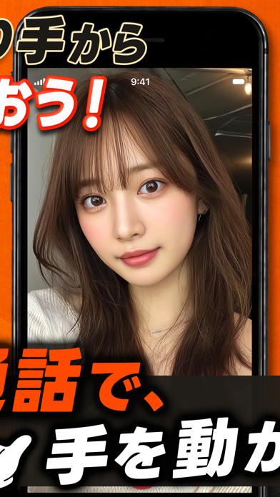
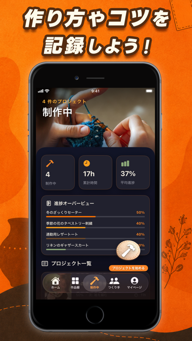
ビデオ通話で、自分だけの手づくり作品を見せ合おう! マンモスは、あなたが作った作品をシェアするアプリです。完成した作品を写真に撮るだけで、フェルト・編み物・かぎ針・裁縫・アクセサリーまで、自分だけのギャラリーがどんどん増えていきます。 作りかけの作品は、ワークショップに登録しておきましょう。使った材料や作り方の手順をメモしておけば、時間ができたときにすぐ続きから再開できます。 今まで作った作品たちは、ホーム画面でひと目で確認できます。作った作品の数や、制作にかけた時間、コレクションの増え方がグラフでチェックできます! ものづくりの楽しさのひとつは、同じ趣味の仲間と出会えること。世界中の作り手の作品を見て回り、好きなスタイルの人をフォローしましょう。気になる作品には、気軽にコメントを送れます。 お互いをフォローし合うと、ワンタップでビデオ通話ができます。新しいテクニックをその場で教わったり、離れた場所で一緒に作業したり。ビデオチャットで作品を見せ合いながら、創作の時間を一緒に楽しめます。 次…
App details
What you can learn from マンモス ビデオ通話で手づくりを見せ合い!
Every shipping app on the App Store has gone through the same decisions you're working through right now: which screenshot goes first, what caption sits over it, which device frame to show, what color the background should be. The 6 screenshots above are マンモス ビデオ通話で手づくりを見せ合い!'s answers to those questions — they're public, they're real, and they made it through Apple's review.
What the numbers say: マンモス ビデオ通話で手づくりを見せ合い! runs a dark set where the background shifts from screenshot to screenshot (first shot #241C14) — each image has to stand on its own, so the captions carry more of the story. The accent colour we picked up, #F45C04, is the one to reuse for badges, arrows and highlighted words if you borrow this look. Hit Use this style to open the editor with these exact colours and drop your own screenshot in.
Notice the first screenshot in particular. It's the one users see in search results and on the product page, and it's where most apps spend their best caption and tightest design. Look at the proportion of background to phone, where the text sits, what one thing the image is trying to communicate.
Want to see how other Lifestyle apps approach the same problem? Browse more Lifestyle apps in the showcase.
Take what works into your own screenshots
Open LaunchShots and design your App Store & Google Play screenshots — pick a device frame, drop captions, ship in minutes. Free, in your browser.
Open the screenshot editor →Apps with a similar look
Closest background + accent colours among the listings we've analysed — useful when you want to see the same palette handled by a different team.