Screenshot changes — detected by LaunchShots
Screenshot style breakdown
Sampled from 6 of Fasting Center: Fast Tracker's App Store screenshots — background, accent and theme, measured by LaunchShots (not something Apple publishes).
#544CB4 bg
#6B65BE
#E4643C accent
#FFFFFF text
Screenshots



iPad screenshots





Icon palette
About this app
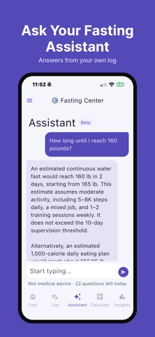
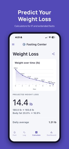
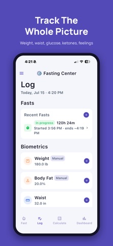
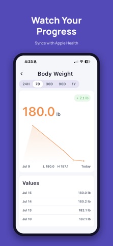
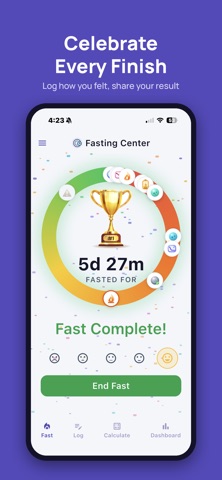
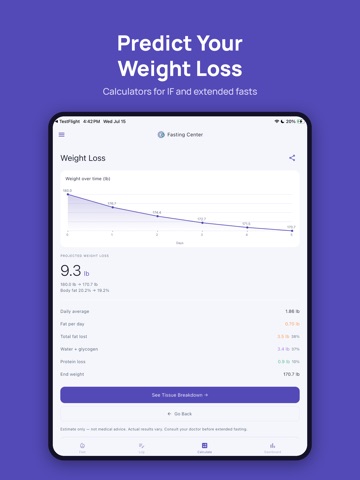
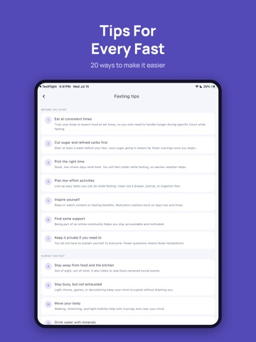
Fasting Center is a fasting timer and tracker for intermittent and extended fasting. Start a fast, watch the ring fill, see which stage your body is in, and keep your numbers in one place. Fast your way - Plans from 12:12 to 23:1 (OMAD), extended fasts of 24, 36, 48 and 72 hours, an open fast with no end, or a specific end time - A live ring that shows time elapsed, time left or percent. Tap the ring to switch - Change the start or end time whenever you need to - Milestone notifications and a reminder before your fast ends - A celebration when you finish, with your mood, a note and a picture of your fast to share Know what is happening - 17 fasting stages, from digestion to refeeding, and what each one means - Tips that make fasting easier - The scientific sources behind the stages and the calculators - Coach: ask about your own fasts, weight and how you feel, and get answers from you…
App details
What you can learn from Fasting Center: Fast Tracker
Every shipping app on the App Store has gone through the same decisions you're working through right now: which screenshot goes first, what caption sits over it, which device frame to show, what color the background should be. The 15 screenshots above are Fasting Center: Fast Tracker's answers to those questions — they're public, they're real, and they made it through Apple's review.
What the numbers say: Fasting Center: Fast Tracker runs a dark set with one background colour (#544CB4) carried across every screenshot — the listing reads as a single poster when the shots sit side by side in search results. The accent colour we picked up, #E4643C, is the one to reuse for badges, arrows and highlighted words if you borrow this look. Hit Use this style to open the editor with these exact colours and drop your own screenshot in.
Notice the first screenshot in particular. It's the one users see in search results and on the product page, and it's where most apps spend their best caption and tightest design. Look at the proportion of background to phone, where the text sits, what one thing the image is trying to communicate.
Want to see how other Health & Fitness apps approach the same problem? Browse more Health & Fitness apps in the showcase.
Take what works into your own screenshots
Open LaunchShots and design your App Store & Google Play screenshots — pick a device frame, drop captions, ship in minutes. Free, in your browser.
Open the screenshot editor →Apps with a similar look
Closest background + accent colours among the listings we've analysed — useful when you want to see the same palette handled by a different team.