Chart position — tracked daily by LaunchShots
Screenshot style breakdown
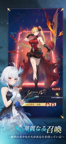
Sampled from 6 of エバーナイト:リバース's App Store screenshots — background, accent and theme, measured by LaunchShots (not something Apple publishes).
#1C1C2C bg
#3B3B49
#445474 accent
#FFFFFF text
Screenshots



iPad screenshots


Icon palette
About this app
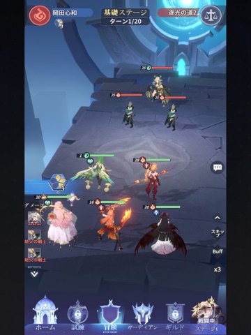
■ 戦略性に富むカードバトル 守護者配置、スキル連携と属性相性を見極めて、最強編成を作り上げよう! 状況に応じた戦術調整が、強敵を打ち破る鍵となる! ■ 領地経営で戦力向上 拠点を強化して資源を集めよう!領地経営で戦力UP! ■ 美しく危険なダークファンタジーの世界 韓国風アートスタイルをベースに、クトゥルフ神話とホラー要素を融合。 朽ちた城、闇の森、深淵の地。ファンタジーな世界を堪能できる! ■ 放置だけで気軽に育成 オフライン中でも資源がどんどん溜まる! ワンタップで資源入手し、守護者を日々強化させよう! ■ 多彩な冒険コンテンツ メインストーリー、ローグライクダンジョン、塔の試練、ワールドボス。 探索するたびに、新たな発見と挑戦があなたを待っている! ■ ギルドで仲間と共闘 ギルドに参加し、仲間と共に強敵へ挑戦しよう! アリーナやギルドバトルで競い合い、無上の栄耀と報酬を手に入れよう! 終わりなき夜はすでに訪れた。 駆夜者、最後の火を灯し、絶望の世界に希望を取り戻せ。 今すぐ『エバーナイト:リバース』であな…
App details
What you can learn from エバーナイト:リバース
Every shipping app on the App Store has gone through the same decisions you're working through right now: which screenshot goes first, what caption sits over it, which device frame to show, what color the background should be. The 18 screenshots above are エバーナイト:リバース's answers to those questions — they're public, they're real, and they made it through Apple's review.
What the numbers say: エバーナイト:リバース runs a dark set where the background shifts from screenshot to screenshot (first shot #1C1C2C) — each image has to stand on its own, so the captions carry more of the story. The accent colour we picked up, #445474, is the one to reuse for badges, arrows and highlighted words if you borrow this look. Hit Use this style to open the editor with these exact colours and drop your own screenshot in.
Notice the first screenshot in particular. It's the one users see in search results and on the product page, and it's where most apps spend their best caption and tightest design. Look at the proportion of background to phone, where the text sits, what one thing the image is trying to communicate.
Want to see how other Games apps approach the same problem? Browse more Games apps in the showcase.
Take what works into your own screenshots
Open LaunchShots and design your App Store & Google Play screenshots — pick a device frame, drop captions, ship in minutes. Free, in your browser.
Open the screenshot editor →Apps with a similar look
Closest background + accent colours among the listings we've analysed — useful when you want to see the same palette handled by a different team.