Chart position — tracked daily by LaunchShots
Screenshot changes — detected by LaunchShots
Screenshot style breakdown
Sampled from 6 of CABAL RED's App Store screenshots — background, accent and theme, measured by LaunchShots (not something Apple publishes).
#342424 bg
#504242
#9C5C54 accent
#FFFFFF text
Screenshots


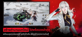


iPad screenshots


Icon palette
About this app
Action MMORPG สมัยใหม่ โลกแห่งไซไฟ-แฟนตาซี แบบ Cross Platform (PC + Mobile) ที่มีจุดเด่นด้วยการต่อสู้ที่รวดเร็ว รุนแรง ตระการตา และระบบ Combo Skill ที่ต่อเนื่องยิ่งกว่า พร้อมรูปแบบดันเจี้ยนที่ท้าทายเป็นเอกลักษณ์ยิ่งขึ้น ผสมผสานกับภาพกราฟิกที่สวยงามล้ำลึกด้วยเทคโนโลยี Unreal Engine เพื่อสร้างประสบการณ์ การเล่นรูปแบบใหม่ให้แก่ชาวเกมเมอร์ไทย - มีกลิ่นอายแนว Soul-like บอสมีระดับความยากสูง การเอาชนะมอนสเตอร์ต้องใช้จังหวะ และการเรียนรู้รูปแบบการโจมตีของศัตรู - โลกแห่งไซไฟ-แฟนตาซี: เรื่องราวเกิดขึ้นบนทวีป Nevareth ที่ผสมผสานเวทมนตร์เข้ากับเทคโนโลยีล้ำสมัยอย่างชุดเกราะไฮเทค และยานพาหนะสุดล้ำ - The Revolution of Action: ฉีกกฎการเก็บเลเวลแบบเดิมๆ ด้วยระบบ Combo ที่ผู้เล่นต้องกดสกิลให้ตรงจังหวะเพื่อทำความเสียหายต่อเนื่อง และสวยงาม - เสน่ห์ที่หาตัวจับยาก: กราฟิกเป็นเอกลักษณ์เฉพาะ ระบบการต่อสู้ที่อาศัย จังหวะและฝีมือ (Skill-based) ยังคงดึงดูดทั้งผู้เล่นหน้าเก่าที่ "คิดถึง" และผู้เล่นหน้าใหม่ที่อยาก…
App details
What you can learn from CABAL RED
Every shipping app on the App Store has gone through the same decisions you're working through right now: which screenshot goes first, what caption sits over it, which device frame to show, what color the background should be. The 20 screenshots above are CABAL RED's answers to those questions — they're public, they're real, and they made it through Apple's review.
What the numbers say: CABAL RED runs a dark set where the background shifts from screenshot to screenshot (first shot #342424) — each image has to stand on its own, so the captions carry more of the story. The accent colour we picked up, #9C5C54, is the one to reuse for badges, arrows and highlighted words if you borrow this look. Hit Use this style to open the editor with these exact colours and drop your own screenshot in.
Notice the first screenshot in particular. It's the one users see in search results and on the product page, and it's where most apps spend their best caption and tightest design. Look at the proportion of background to phone, where the text sits, what one thing the image is trying to communicate.
Want to see how other Games apps approach the same problem? Browse more Games apps in the showcase.
Take what works into your own screenshots
Open LaunchShots and design your App Store & Google Play screenshots — pick a device frame, drop captions, ship in minutes. Free, in your browser.
Open the screenshot editor →Apps with a similar look
Closest background + accent colours among the listings we've analysed — useful when you want to see the same palette handled by a different team.