Chart position — tracked daily by LaunchShots
Screenshot changes — detected by LaunchShots
Screenshot style breakdown
Sampled from 6 of Drone Fly Zone: Дроны, Прогноз's App Store screenshots — background, accent and theme, measured by LaunchShots (not something Apple publishes).
#34D4DC bg
#2DBAC1
#243C74 accent
#111111 text
Screenshots


Icon palette
About this app
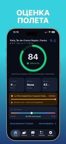
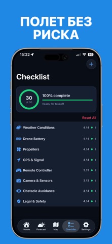
Drone Weather Forecast помогает пилотам дронов быстро проверять погодные условия и определять, безопасно ли выполнять полёт. Получайте оценку Safe to Fly в реальном времени на основе скорости ветра, порывов, видимости, осадков, облачности, условий освещённости и авиационной активности поблизости. Возможности: • Оценка Safe to Fly • Текущие погодные условия • Прогноз ветра • Авиационные предупреждения • Информация о ближайших аэропортах и вертолётных площадках • Интерактивная карта полётов • Сохранённые локации • Чек-лист для полётов на дроне Перейдите на Drone Weather Forecast Pro, чтобы получить доступ к глобальному поиску локаций, данным о ветре на разных высотах, почасовым прогнозам по высоте и расширенному прогнозу на 7 дней. Независимо от того, используете ли вы DJI, Autel, FPV или любительский дрон, Drone Weather Forecast поможет принимать более обоснованные решения пе…
App details
What you can learn from Drone Fly Zone: Дроны, Прогноз
Every shipping app on the App Store has gone through the same decisions you're working through right now: which screenshot goes first, what caption sits over it, which device frame to show, what color the background should be. The 6 screenshots above are Drone Fly Zone: Дроны, Прогноз's answers to those questions — they're public, they're real, and they made it through Apple's review.
What the numbers say: Drone Fly Zone: Дроны, Прогноз runs a mixed light-and-dark set where the background shifts from screenshot to screenshot (first shot #34D4DC) — each image has to stand on its own, so the captions carry more of the story. The accent colour we picked up, #243C74, is the one to reuse for badges, arrows and highlighted words if you borrow this look. Hit Use this style to open the editor with these exact colours and drop your own screenshot in.
Notice the first screenshot in particular. It's the one users see in search results and on the product page, and it's where most apps spend their best caption and tightest design. Look at the proportion of background to phone, where the text sits, what one thing the image is trying to communicate.
Want to see how other Weather apps approach the same problem? Browse more Weather apps in the showcase.
Take what works into your own screenshots
Open LaunchShots and design your App Store & Google Play screenshots — pick a device frame, drop captions, ship in minutes. Free, in your browser.
Open the screenshot editor →Apps with a similar look
Closest background + accent colours among the listings we've analysed — useful when you want to see the same palette handled by a different team.