Screenshot changes — detected by LaunchShots
Screenshot style breakdown
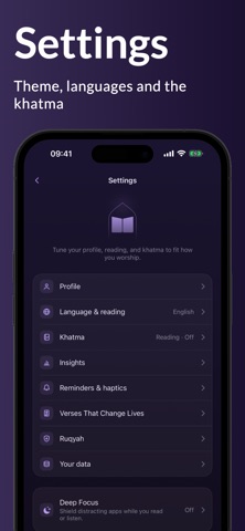
Sampled from 6 of Wird: Daily Quran's App Store screenshots — background, accent and theme, measured by LaunchShots (not something Apple publishes).
#B49CEC bg
#9E89CF
#4C7C64 accent
#111111 text
Screenshots
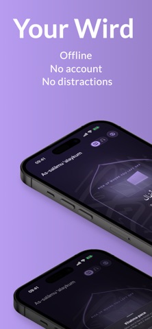


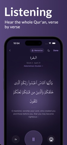
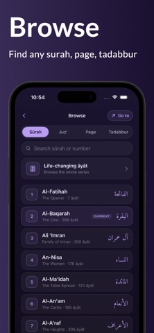

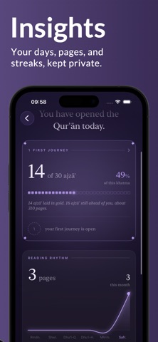

iPad screenshots


Icon palette
About this app
Wird ist ein ruhiger, offline-first Quran-Leser und -Player, der dir hilft, eine dauerhafte tägliche Gewohnheit aufzubauen. Keine Werbung. Kein Konto. Kein Lärm. Nur du und das Buch. Öffne es und lies, oder hör zu. Wird macht eine Sache, und macht sie gut: Es hilft dir, dich jeden Tag mit dem Quran zu verbinden. WARUM WIRD • Kostenlos und werbefrei. Keine Werbung, keine Abos, kein Drängen. Die ganze App gehört schon dir. • Nie ein Konto. Keine Anmeldung, keine E-Mail, kein Login. Dein Lesen bleibt zwischen dir und deinem Herrn. • Vollständig offline. Der ganze Quran, und deine Rezitationen nach dem Download, liegen auf deinem Gerät. Kein Internet nötig. • Privat von Grund auf. Fortschritt, Serie und Name bleiben auf deinem Telefon. Keine Konten, keine Werbung, nichts wird verkauft. Um Wird zu verbessern, sendet die App nur anonyme, aggregierte Nutzungszahlen, nie mit dir verknüpft. • …
App details
What you can learn from Wird: Daily Quran
Every shipping app on the App Store has gone through the same decisions you're working through right now: which screenshot goes first, what caption sits over it, which device frame to show, what color the background should be. The 15 screenshots above are Wird: Daily Quran's answers to those questions — they're public, they're real, and they made it through Apple's review.
What the numbers say: Wird: Daily Quran runs a mixed light-and-dark set where the background shifts from screenshot to screenshot (first shot #B49CEC) — each image has to stand on its own, so the captions carry more of the story. The accent colour we picked up, #4C7C64, is the one to reuse for badges, arrows and highlighted words if you borrow this look. Hit Use this style to open the editor with these exact colours and drop your own screenshot in.
Notice the first screenshot in particular. It's the one users see in search results and on the product page, and it's where most apps spend their best caption and tightest design. Look at the proportion of background to phone, where the text sits, what one thing the image is trying to communicate.
Want to see how other Reference apps approach the same problem? Browse more Reference apps in the showcase.
Take what works into your own screenshots
Open LaunchShots and design your App Store & Google Play screenshots — pick a device frame, drop captions, ship in minutes. Free, in your browser.
Open the screenshot editor →Apps with a similar look
Closest background + accent colours among the listings we've analysed — useful when you want to see the same palette handled by a different team.