Chart position — tracked daily by LaunchShots
Screenshot style breakdown
Sampled from 6 of Truba messenger's App Store screenshots — background, accent and theme, measured by LaunchShots (not something Apple publishes).
#2C6CFC bg
#4980FC
#84ACFC accent
#FFFFFF text
Screenshots




Icon palette
About this app
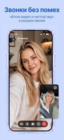
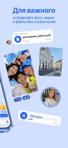
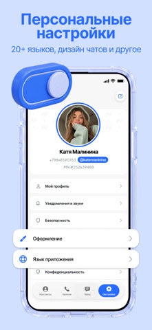
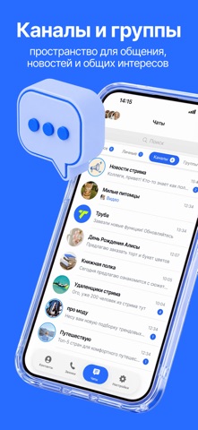
Будь всегда на связи. Truba - современный мессенджер для тех, кому важно всегда оставаться на связи с родными, друзьями и коллегами. Наслаждайтесь качественными голосовыми и видеозвонками, быстрым обменом сообщениями и простым общением без лишних сложностей. Когда связь особенно важна - Труба помогает быть рядом. Возможности • Голосовые звонки высокого качества • Видеозвонки HD • Личные и групповые чаты • Мгновенная отправка файлов • Быстрая и стабильная работа • Современное сквозное шифрование • Простой и удобный интерфейс Почему Truba? Мы создаём альтернативный способ связи для тех моментов, когда важно быстро дозвониться, услышать близкого человека или провести важный разговор. Truba — это надёжное общение без лишних препятствий, чтобы вы всегда могли оставаться на связи с теми, кто действительно важен. Пригласите близких Поделитесь Truba с родными, друзьями и коллегам…
App details
What you can learn from Truba messenger
Every shipping app on the App Store has gone through the same decisions you're working through right now: which screenshot goes first, what caption sits over it, which device frame to show, what color the background should be. The 8 screenshots above are Truba messenger's answers to those questions — they're public, they're real, and they made it through Apple's review.
What the numbers say: Truba messenger runs a mixed light-and-dark set where the background shifts from screenshot to screenshot (first shot #2C6CFC) — each image has to stand on its own, so the captions carry more of the story. The accent colour we picked up, #84ACFC, is the one to reuse for badges, arrows and highlighted words if you borrow this look. Hit Use this style to open the editor with these exact colours and drop your own screenshot in.
Notice the first screenshot in particular. It's the one users see in search results and on the product page, and it's where most apps spend their best caption and tightest design. Look at the proportion of background to phone, where the text sits, what one thing the image is trying to communicate.
Want to see how other Social Networking apps approach the same problem? Browse more Social Networking apps in the showcase.
Take what works into your own screenshots
Open LaunchShots and design your App Store & Google Play screenshots — pick a device frame, drop captions, ship in minutes. Free, in your browser.
Open the screenshot editor →Apps with a similar look
Closest background + accent colours among the listings we've analysed — useful when you want to see the same palette handled by a different team.