Screenshot style breakdown
Sampled from 6 of Clearrift's App Store screenshots — background, accent and theme, measured by LaunchShots (not something Apple publishes).
#E4ECF4 bg
#C8CFD6
#84BCCC accent
#111111 text
Reading the caption text from the screenshots in your browser…
Screenshots
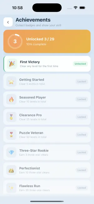
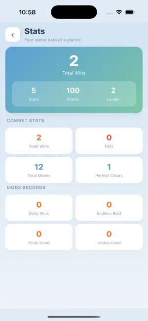
Icon palette
About this app
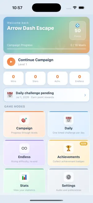
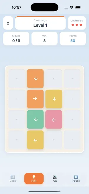
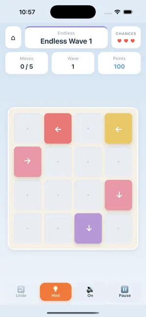
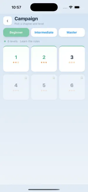
Clearrift is a casual puzzle game. Colorful arrows are scattered across the board—you need to figure out the right tap order, send them dashing in the directions they point until they fly off the board, and clear the entire field to win. - Core gameplay: Tap an arrow to move it straight in its direction; if the path is clear, it flies off the board and is removed - Failure condition: If the path is blocked and the arrow cannot move, you lose a chance; run out of chances and the run ends - Campaign: 18 levels across three difficulty chapters, unlocked one by one—ideal for a gradual challenge from easy to hard - Daily challenge: One timed level per day; complete it to earn bonus points - Endless mode: Each wave adds more arrows and ramps up the difficulty—see how far you can go - Assist tools: Hints highlight a movable arrow; undo steps back one move—both cost points - Progress tracking:…
App details
What you can learn from Clearrift
Every shipping app on the App Store has gone through the same decisions you're working through right now: which screenshot goes first, what caption sits over it, which device frame to show, what color the background should be. The 6 screenshots above are Clearrift's answers to those questions — they're public, they're real, and they made it through Apple's review.
What the numbers say: Clearrift runs a light set with one background colour (#E4ECF4) carried across every screenshot — the listing reads as a single poster when the shots sit side by side in search results. The accent colour we picked up, #84BCCC, is the one to reuse for badges, arrows and highlighted words if you borrow this look. Hit Use this style to open the editor with these exact colours and drop your own screenshot in.
Notice the first screenshot in particular. It's the one users see in search results and on the product page, and it's where most apps spend their best caption and tightest design. Look at the proportion of background to phone, where the text sits, what one thing the image is trying to communicate.
Want to see how other Weather apps approach the same problem? Browse more Weather apps in the showcase.
Take what works into your own screenshots
Open LaunchShots and design your App Store & Google Play screenshots — pick a device frame, drop captions, ship in minutes. Free, in your browser.
Open the screenshot editor →Apps with a similar look
Closest background + accent colours among the listings we've analysed — useful when you want to see the same palette handled by a different team.