Screenshot style breakdown
Sampled from 5 of Orbital Traffic: Space Tracker's App Store screenshots — background, accent and theme, measured by LaunchShots (not something Apple publishes).
#0C0C14 bg
#2E2E34
#1C446C accent
#FFFFFF text
Screenshots



Icon palette
About this app
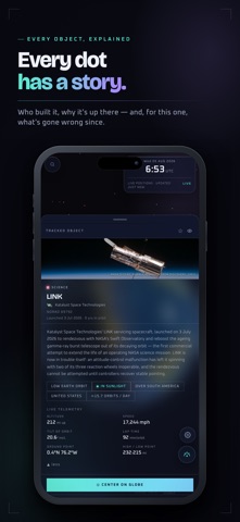
Space has traffic. Watch it move. Orbital Traffic puts more than 19,000 tracked objects on a live 3D globe: the International Space Station, crewed capsules, fresh Starlink trains, navigation and communications satellites, debris and near-Earth asteroids. Every position is computed on your phone from the latest orbital data. No ads. No account. Nothing about you leaves your device. PASS ALERTS Get a heads-up 10 minutes before the ISS or a Starlink train crosses your sky. Alerts fire only for passes worth stepping outside for: high in the sky, in sunlight, and never in the middle of the night. One a day at most. Tap the bell on any pass to make sure you get that one. SEE IT FROM THE GROUND Open the ISS or a train and find out when it passes over you next: what time, where to look, how high it climbs, and a sky chart of its path. STARLINK TRAINS Freshly launched batches are spotted a…
App details
What you can learn from Orbital Traffic: Space Tracker
Every shipping app on the App Store has gone through the same decisions you're working through right now: which screenshot goes first, what caption sits over it, which device frame to show, what color the background should be. The 5 screenshots above are Orbital Traffic: Space Tracker's answers to those questions — they're public, they're real, and they made it through Apple's review.
What the numbers say: Orbital Traffic: Space Tracker runs a dark set with one background colour (#0C0C14) carried across every screenshot — the listing reads as a single poster when the shots sit side by side in search results. The accent colour we picked up, #1C446C, is the one to reuse for badges, arrows and highlighted words if you borrow this look. Hit Use this style to open the editor with these exact colours and drop your own screenshot in.
Notice the first screenshot in particular. It's the one users see in search results and on the product page, and it's where most apps spend their best caption and tightest design. Look at the proportion of background to phone, where the text sits, what one thing the image is trying to communicate.
Want to see how other Reference apps approach the same problem? Browse more Reference apps in the showcase.
Take what works into your own screenshots
Open LaunchShots and design your App Store & Google Play screenshots — pick a device frame, drop captions, ship in minutes. Free, in your browser.
Open the screenshot editor →Apps with a similar look
Closest background + accent colours among the listings we've analysed — useful when you want to see the same palette handled by a different team.