Chart position — tracked daily by LaunchShots
Screenshot changes — detected by LaunchShots
Screenshot style breakdown
Sampled from 6 of おさんぽびより - 犬の天気とお散歩アラート's App Store screenshots — background, accent and theme, measured by LaunchShots (not something Apple publishes).
#DCECC4 bg
#C1CFAC
#8CDCF4 accent
#111111 text
Screenshots


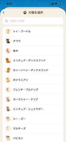
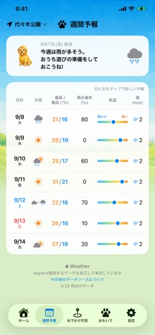


Icon palette
About this app
「今日、お散歩に出ても大丈夫かな?」 気温26℃の晴れた日。人には気持ちいい陽気でも、真夏のアスファルトは50℃を超えることがあります。素足で歩くわんこにとっての「今日の天気」は、私たちが見ている天気予報とは少し違います。 おさんぽびよりは、そんなわんこ目線の天気を毎日お届けする、犬の飼い主さんのための天気アプリです。広告なし。基本機能はすべて無料で使えます。 こんなことがわかります ・お散歩指数:気温・湿度・雨・風・路面温度から「今、出て大丈夫?」を0〜100でお答え。1時間ごとの指数と「おすすめのお散歩時間」つき ・スコアの内訳:なぜこの点数なのか、7つの要素(暑さ・路面・雨・寒さ・風・紫外線・乾燥)をいつでも確認できます ・路面温度の目安:太陽の高さや雲・雨のようすから路面の熱さを推定。肉球への負担が心配な時間帯をお知らせ ・熱中症リスク:環境省の暑さ指数区分と獣医師監修の公開資料に基づく判定。短頭種・子犬・シニアの子はより慎重に ・雨雲レーダー:気象庁の高解像度降水ナウキャストで、雨雲の動きを地図…
App details
What you can learn from おさんぽびより - 犬の天気とお散歩アラート
Every shipping app on the App Store has gone through the same decisions you're working through right now: which screenshot goes first, what caption sits over it, which device frame to show, what color the background should be. The 10 screenshots above are おさんぽびより - 犬の天気とお散歩アラート's answers to those questions — they're public, they're real, and they made it through Apple's review.
What the numbers say: おさんぽびより - 犬の天気とお散歩アラート runs a light set where the background shifts from screenshot to screenshot (first shot #DCECC4) — each image has to stand on its own, so the captions carry more of the story. The accent colour we picked up, #8CDCF4, is the one to reuse for badges, arrows and highlighted words if you borrow this look. Hit Use this style to open the editor with these exact colours and drop your own screenshot in.
Notice the first screenshot in particular. It's the one users see in search results and on the product page, and it's where most apps spend their best caption and tightest design. Look at the proportion of background to phone, where the text sits, what one thing the image is trying to communicate.
Want to see how other Weather apps approach the same problem? Browse more Weather apps in the showcase.
Take what works into your own screenshots
Open LaunchShots and design your App Store & Google Play screenshots — pick a device frame, drop captions, ship in minutes. Free, in your browser.
Open the screenshot editor →Apps with a similar look
Closest background + accent colours among the listings we've analysed — useful when you want to see the same palette handled by a different team.