Screenshot changes — detected by LaunchShots
Screenshot style breakdown
Sampled from 6 of nokki - 音楽ジャーナル's App Store screenshots — background, accent and theme, measured by LaunchShots (not something Apple publishes).
#F4ECDC bg
#D6CFC1
#444474 accent
#111111 text
Reading the caption text from the screenshots in your browser…
Screenshots



Icon palette
About this app
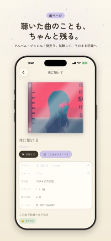
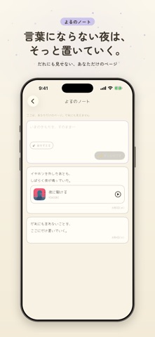
きいた音楽が、日記になる。 nokki(のっき)は、きょう聴いた曲とそのときの気分を、30秒で記録できる音楽ジャーナルです。 ■ つかいかたは3ステップ 1. 曲をえらぶ(Apple Musicから検索、最近聴いた曲からワンタップでも) 2. 気分をタップ(うれしい・おだやか・エモい…9種類のパステルから) 3. ひとことメモ(書いても書かなくても。公開・じぶんだけも選べます) ■ カレンダーに思い出がたまる 記録は自動でカレンダーに。「この日なに聴いてたっけ?」がすぐ見つかります。 月末には、あなたの記録からAIがひと月をやさしくふりかえってくれます。 ■ 友達とだけ、ゆるく共有 つながるのは、QRコードで申請しておたがいに承認した友達だけ。フォロワーも足あともありません。 投稿ごとに「友達まで」「じぶんだけ」を選べて、友達の記録にはいいねとコメントができます。 だれにも見せない「よるのノート」もあるので、ひとりごとみたいな記録もここに。 ■ 曲はその場で試聴できる 気になった曲は再生ボタンでプレビュー。Apple Music加入者ならフル再生も。 ■ ア…
App details
What you can learn from nokki - 音楽ジャーナル
Every shipping app on the App Store has gone through the same decisions you're working through right now: which screenshot goes first, what caption sits over it, which device frame to show, what color the background should be. The 7 screenshots above are nokki - 音楽ジャーナル's answers to those questions — they're public, they're real, and they made it through Apple's review.
What the numbers say: nokki - 音楽ジャーナル runs a light set with one background colour (#F4ECDC) carried across every screenshot — the listing reads as a single poster when the shots sit side by side in search results. The accent colour we picked up, #444474, is the one to reuse for badges, arrows and highlighted words if you borrow this look. Hit Use this style to open the editor with these exact colours and drop your own screenshot in.
Notice the first screenshot in particular. It's the one users see in search results and on the product page, and it's where most apps spend their best caption and tightest design. Look at the proportion of background to phone, where the text sits, what one thing the image is trying to communicate.
Want to see how other Music apps approach the same problem? Browse more Music apps in the showcase.
Take what works into your own screenshots
Open LaunchShots and design your App Store & Google Play screenshots — pick a device frame, drop captions, ship in minutes. Free, in your browser.
Open the screenshot editor →Apps with a similar look
Closest background + accent colours among the listings we've analysed — useful when you want to see the same palette handled by a different team.