Chart position — tracked daily by LaunchShots
Screenshot style breakdown
Sampled from 6 of صيف السعودية's App Store screenshots — background, accent and theme, measured by LaunchShots (not something Apple publishes).
#14141C bg
#34343B
#6C3C2C accent
#FFFFFF text
Reading the caption text from the screenshots in your browser…
Screenshots




iPad screenshots


Icon palette
About this app
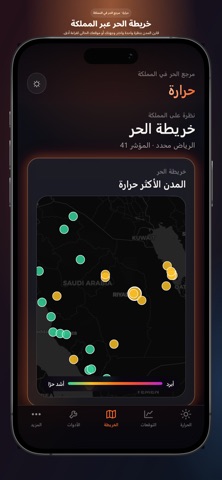
حرارة تطبيق طقس يساعدك تفهم الحر بوضوح — مو بس درجة الحرارة. في أيام المملكة الحارة، الرقم وحده ما يكفي. حرارة يجمع قراءة الهواء، الإحساس، الأشعة، ومؤشر عبء الحر من ٠ إلى ١٠٠؛ عشان تعرف متى تخرج، متى ترتاح، وكيف تحمي نفسك ومن معك. ماذا يقدّم التطبيق؟ • مؤشر الحر اليومي قراءة سريعة وواضحة لعبء الحر، مع درجة الحرارة والإحساس والرطوبة والرياح. • توقعات الإرهاق الحراري تابع منحنى الحر ساعة بساعة، واعرف أوقات الذروة قبل ما تخطّط ليومك. • خريطة الحر في المملكة قارن المدن بنظرة واحدة، أو استخدم موقعك الحالي لقراءة أدق. • أدوات وقاية عملية تتبّع الترطيب، تقدير التعرّض للشمس، ونصائح ملابس مناسبة لحرارة اليوم. • حرارة مقصورة السيارة احفظ مكان ركن سيارتك واحصل على تقدير لارتفاع حرارة المقصورة، مع تنبيهات ذكية عند ارتفاع درجة الحرارة المتوقعة. • مواقيت الصلاة حسب تقويم أم القرى، مع الشروق والغروب، وعدّ تنازلي حيّ حتى الصلاة القادمة. ويمكنك تفعيل تنبيه اختياري قبل الفرض بـ ٥ أو ١٠ أو ١٥ دقيق…
App details
What you can learn from صيف السعودية
Every shipping app on the App Store has gone through the same decisions you're working through right now: which screenshot goes first, what caption sits over it, which device frame to show, what color the background should be. The 13 screenshots above are صيف السعودية's answers to those questions — they're public, they're real, and they made it through Apple's review.
What the numbers say: صيف السعودية runs a dark set with one background colour (#14141C) carried across every screenshot — the listing reads as a single poster when the shots sit side by side in search results. The accent colour we picked up, #6C3C2C, is the one to reuse for badges, arrows and highlighted words if you borrow this look. Hit Use this style to open the editor with these exact colours and drop your own screenshot in.
Notice the first screenshot in particular. It's the one users see in search results and on the product page, and it's where most apps spend their best caption and tightest design. Look at the proportion of background to phone, where the text sits, what one thing the image is trying to communicate.
Want to see how other Weather apps approach the same problem? Browse more Weather apps in the showcase.
Take what works into your own screenshots
Open LaunchShots and design your App Store & Google Play screenshots — pick a device frame, drop captions, ship in minutes. Free, in your browser.
Open the screenshot editor →Apps with a similar look
Closest background + accent colours among the listings we've analysed — useful when you want to see the same palette handled by a different team.