Chart position — tracked daily by LaunchShots
Screenshot style breakdown
Sampled from 6 of Parata - Notfallordner's App Store screenshots — background, accent and theme, measured by LaunchShots (not something Apple publishes).
#0C5444 bg
#2E6B5E
#549484 accent
#FFFFFF text
Reading the caption text from the screenshots in your browser…
Screenshots


iPad screenshots



Icon palette
About this app
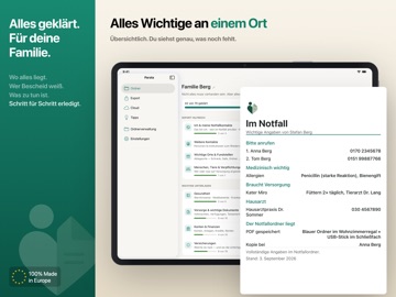
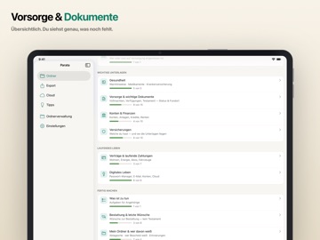
Parata hilft dir, einen Notfallordner zusammenzustellen: eine Sammlung aller wichtigen Informationen, die deiner Familie hilft, wenn du einmal nicht mehr helfen kannst. Wo alles liegt, wer Bescheid weiß, was zu tun ist – an einem Ort, verständlich für die, die zurückbleiben. Die meisten schieben genau das auf – nicht aus Nachlässigkeit, sondern weil es sich nach einem großen, schweren Projekt anfühlt. Parata nimmt dieses Gefühl weg. Statt einer leeren Mappe führt es dich in kleinen, ruhigen Schritten durch alles Wichtige: Du siehst jederzeit deinen Fortschritt, kannst pausieren und machst genau da weiter, wo du aufgehört hast. Die ersten Einträge – wichtige Kontakte und Fundorte – hast du in wenigen Minuten erfasst, per Kontakt-Auswahl und automatischem Ausfüllen. „Nicht vorhanden" ist dabei eine völlig gültige Antwort. Kein Druck, keine roten Warnungen – du klärst, was zu klären ist,…
App details
What you can learn from Parata - Notfallordner
Every shipping app on the App Store has gone through the same decisions you're working through right now: which screenshot goes first, what caption sits over it, which device frame to show, what color the background should be. The 15 screenshots above are Parata - Notfallordner's answers to those questions — they're public, they're real, and they made it through Apple's review.
What the numbers say: Parata - Notfallordner runs a mixed light-and-dark set where the background shifts from screenshot to screenshot (first shot #0C5444) — each image has to stand on its own, so the captions carry more of the story. The accent colour we picked up, #549484, is the one to reuse for badges, arrows and highlighted words if you borrow this look. Hit Use this style to open the editor with these exact colours and drop your own screenshot in.
Notice the first screenshot in particular. It's the one users see in search results and on the product page, and it's where most apps spend their best caption and tightest design. Look at the proportion of background to phone, where the text sits, what one thing the image is trying to communicate.
Want to see how other Productivity apps approach the same problem? Browse more Productivity apps in the showcase.
Take what works into your own screenshots
Open LaunchShots and design your App Store & Google Play screenshots — pick a device frame, drop captions, ship in minutes. Free, in your browser.
Open the screenshot editor →Apps with a similar look
Closest background + accent colours among the listings we've analysed — useful when you want to see the same palette handled by a different team.