Chart position — tracked daily by LaunchShots
Screenshot changes — detected by LaunchShots
Screenshot style breakdown
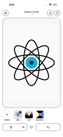
Sampled from 6 of 一划清's App Store screenshots — background, accent and theme, measured by LaunchShots (not something Apple publishes).
#FCFCFC bg
#DDDDDD
#04B4D4 accent
#111111 text
Screenshots



Icon palette
About this app
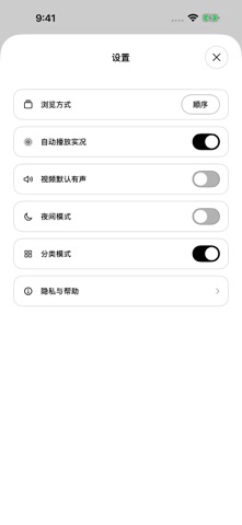
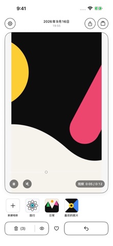
• 左右滑动浏览照片和视频,上滑加入待删除 • 开启分类模式,下拖照片或视频到相册封面即可加入 • 新建、排序、重命名和删除普通相册,分类结果同步系统相册 • 按相册、个人收藏、视频或截屏筛选浏览 • 双击进入大图,照片和视频都可双指缩放、拖动查看 • 同步系统“个人收藏”,通过系统分享页分享当前照片或视频 • 在总览中快速定位,支持顺序或随机浏览 • 支持夜间模式 一划清不需要账号,不含广告,不使用第三方统计工具,也不提供开发者自建的联网服务。浏览和整理在设备上完成,不会自动上传照片、视频、媒体信息或使用记录。只有你主动分享时,系统才会把所选内容交给你选择的应用或接收方。若原件仅在 iCloud,iOS 可能通过系统照片服务下载原件。 上滑只做标记,不会立即删除。最终删除由 iOS 显示系统确认窗口;确认后,照片和视频会进入系统相册的“最近删除”,可在系统保留期内恢复。在相册内确认删除也会删除系统图库中的原项目;移出相册或删除相册则会保留原照片和视频。 帮助与反馈:asa24@qq.com 小红书:Asa阿洒
App details
What you can learn from 一划清
Every shipping app on the App Store has gone through the same decisions you're working through right now: which screenshot goes first, what caption sits over it, which device frame to show, what color the background should be. The 7 screenshots above are 一划清's answers to those questions — they're public, they're real, and they made it through Apple's review.
What the numbers say: 一划清 runs a mixed light-and-dark set where the background shifts from screenshot to screenshot (first shot #FCFCFC) — each image has to stand on its own, so the captions carry more of the story. The accent colour we picked up, #04B4D4, is the one to reuse for badges, arrows and highlighted words if you borrow this look. Hit Use this style to open the editor with these exact colours and drop your own screenshot in.
Notice the first screenshot in particular. It's the one users see in search results and on the product page, and it's where most apps spend their best caption and tightest design. Look at the proportion of background to phone, where the text sits, what one thing the image is trying to communicate.
Want to see how other Photo & Video apps approach the same problem? Browse more Photo & Video apps in the showcase.
Take what works into your own screenshots
Open LaunchShots and design your App Store & Google Play screenshots — pick a device frame, drop captions, ship in minutes. Free, in your browser.
Open the screenshot editor →Apps with a similar look
Closest background + accent colours among the listings we've analysed — useful when you want to see the same palette handled by a different team.