Chart position — tracked daily by LaunchShots
Screenshot style breakdown
Sampled from 6 of ترجمة انجليزي عربي بدون نت's App Store screenshots — background, accent and theme, measured by LaunchShots (not something Apple publishes).
#1C1C1C bg
#3B3B3B
#24ACE4 accent
#FFFFFF text
Screenshots


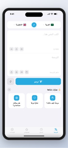


iPad screenshots


Icon palette
About this app
اكتشف أسهل وأسرع طريقة لترجمة النصوص بين اللغات. تم تصميم تطبيق "ترجمة انجليزي عربي بدون نت" ليقدم لك تجربة ترجمة سلسة، دقيقة، وخالية من التعقيد، ليكون رفيقك الدائم في السفر، العمل، أو التعلم، والأهم من ذلك أنه يعمل في أي وقت ومكان! المميزات الرئيسية: - ترجمة بدون إنترنت (Offline): تمتع بترجمة دقيقة وسريعة حتى في حال عدم توفر شبكة اتصال أو واي فاي. - ترجمة متعددة اللغات: يدعم مجموعة واسعة من اللغات العالمية. - العبارات الشائعة: وصول سريع إلى بطاقات جاهزة لأكثر العبارات استخداماً لتسهيل تواصلك اليومي. - سجل الترجمات: حفظ تلقائي لجميع ترجماتك للرجوع إليها لاحقاً، مع تحكم كامل لحذف أي ترجمة أو مسح السجل بالكامل بضغطة زر. - المفضلة: احتفظ بالترجمات الهامة في قائمة المفضلة للوصول إليها في أي وقت دون الحاجة للبحث. - تخصيص الواجهة: يدعم "الوضع الليلي" لراحة العين أثناء الاستخدام في الإضاءة المنخفضة. - واجهة مستخدم عصرية: تصميم نظيف، فاخر، وسهل الاستخدام. الخصوصية والأمان: خصوصيتك هي أولويتن…
App details
What you can learn from ترجمة انجليزي عربي بدون نت
Every shipping app on the App Store has gone through the same decisions you're working through right now: which screenshot goes first, what caption sits over it, which device frame to show, what color the background should be. The 16 screenshots above are ترجمة انجليزي عربي بدون نت's answers to those questions — they're public, they're real, and they made it through Apple's review.
What the numbers say: ترجمة انجليزي عربي بدون نت runs a dark set with one background colour (#1C1C1C) carried across every screenshot — the listing reads as a single poster when the shots sit side by side in search results. The accent colour we picked up, #24ACE4, is the one to reuse for badges, arrows and highlighted words if you borrow this look. Hit Use this style to open the editor with these exact colours and drop your own screenshot in.
Notice the first screenshot in particular. It's the one users see in search results and on the product page, and it's where most apps spend their best caption and tightest design. Look at the proportion of background to phone, where the text sits, what one thing the image is trying to communicate.
Want to see how other Reference apps approach the same problem? Browse more Reference apps in the showcase.
Take what works into your own screenshots
Open LaunchShots and design your App Store & Google Play screenshots — pick a device frame, drop captions, ship in minutes. Free, in your browser.
Open the screenshot editor →Apps with a similar look
Closest background + accent colours among the listings we've analysed — useful when you want to see the same palette handled by a different team.